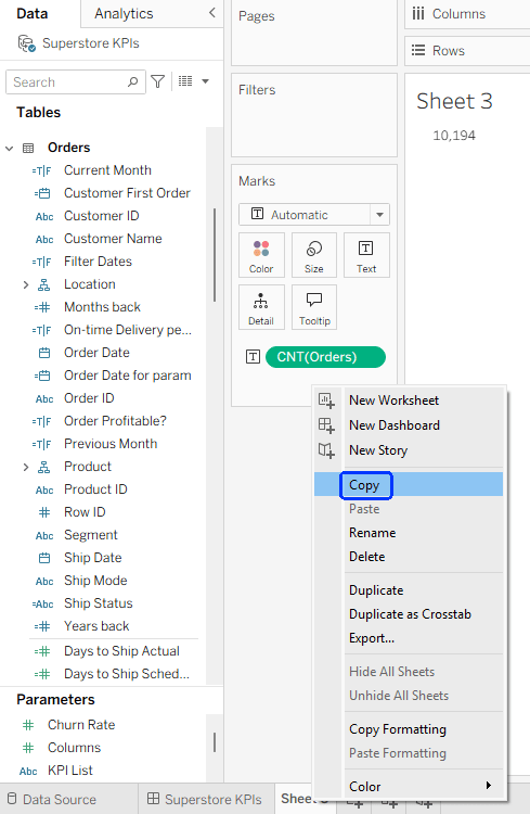
My session at DataFam Europe included a section about some limitations of Tableau’s multi-fact model, especially regarding stuff you can do in an “old” model but not with multiple fact (base) tables.
A recent bout of troubleshooting with a customer unearthed some new revelations, and a partial solution, for the “Dimension switching” problem that I had demonstrated.
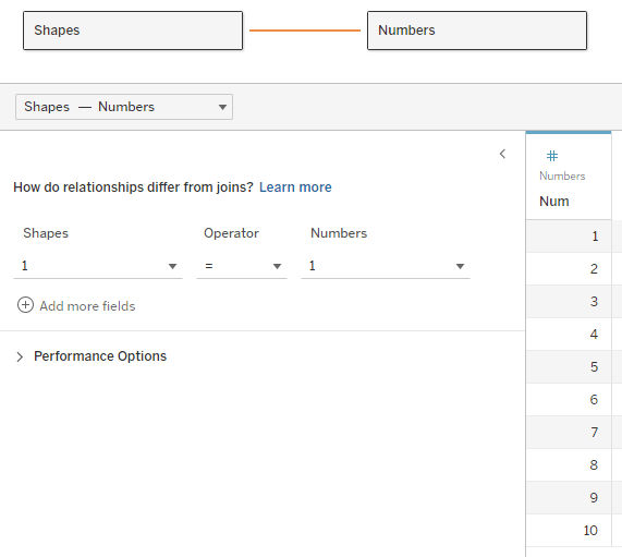
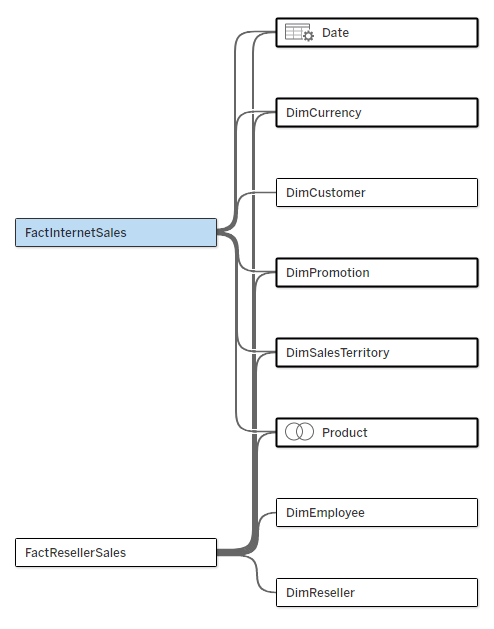
Let’s start with the problem. I have a multi-fact data source, as below. The two fact tables have five common dimensions (Date, Currency, Promotion, Sales Territory, and Product), Customer is related only to Internet Sales, and Employee and Reseller only to Reseller Sales.
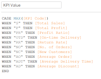
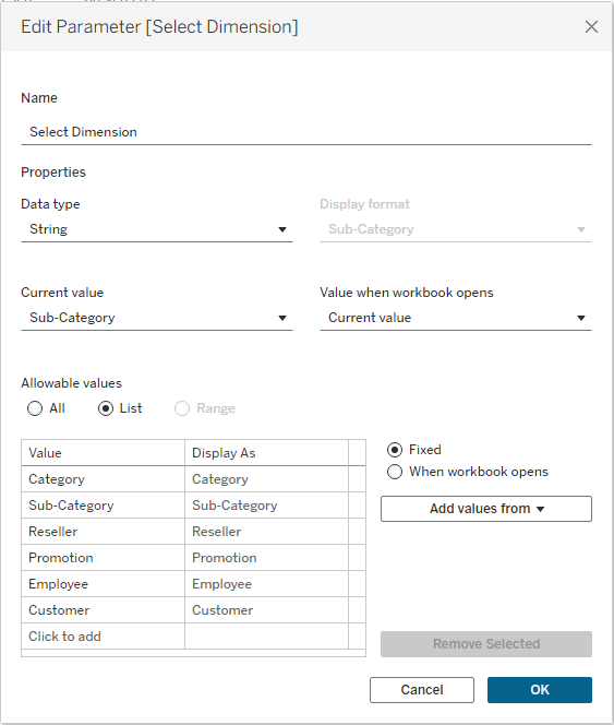
I‘ll start by creating a parameter that will enable me to switch dimensions in my worksheet:
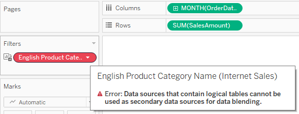
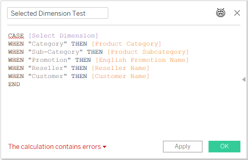
Now I create a calculated field based on this parameter, which can be placed in my chart or table, and I get an error:
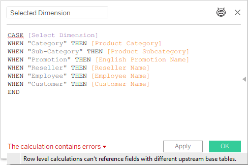
Not good. In an old model, with just one base table, you can switch any field using this technique. Now, even if I’m only intending to use this “Selected Dimension” field with a measure from one base table (and I haven’t placed it in the worksheet yet), Tableau is already giving me an error.
This is where the customer’s story comes in. One of the developers tried this, and received an error as expected, but another developer, working with a different data source (also multi-fact), managed to create a similar calculated field and use it in a worksheet. So we started investigating, and after some trial and error we now understand when the technique works, and, more importantly, why.
I already know (from a conversation with Thomas Nhan, the Product Manager) that Tableau calculations in multi-fact data sources start from the base table. We’ll keep this in mind during the following examples.
Step 1
We start by referencing only a couple of shared dimensions from different tables (note that Category and Sub-Category are from the same table):
That’s an error, because Tableau can’t decide from which base table to start calculating.
Step 2
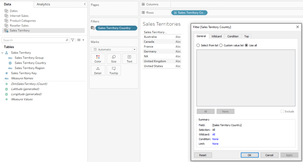
We add a dimension that’s related only to one base table:
No error, because Tableau can decide, based on the [Reseller Name] field, that it has to use the FactResellerSales base table.
That’s the key: give Tableau a clue regarding which base table to use, and it will use it. Let’s try something else:
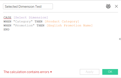
Step 3
That’s not working, because [Reseller Name] and [Customer Name] are related to different base tables. And it reminds us that dimension switching will only work with measures from a single base table, which we’ll see in the final result.
But even if all the dimensions you need are related to multiple base tables – add a dummy field from the table that you’re referring to, just as a pointer:
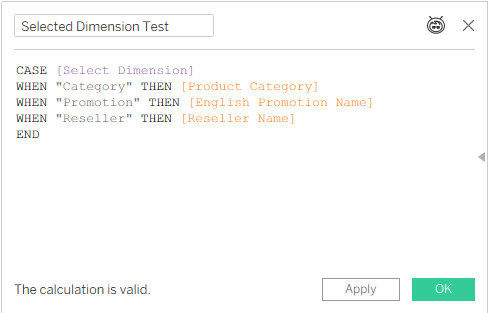
Step 4
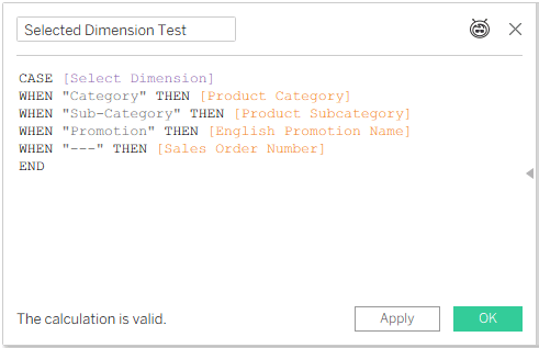
This is OK. Category, Sub-Category, and Promotion are all related to both Internet Sales and Reseller Sales, but Sales Order Number, which will never be used because “—” is not a value in the parameter list, is in the Internet Sales fact table, so it is telling Tableau to start calculating from that base table.
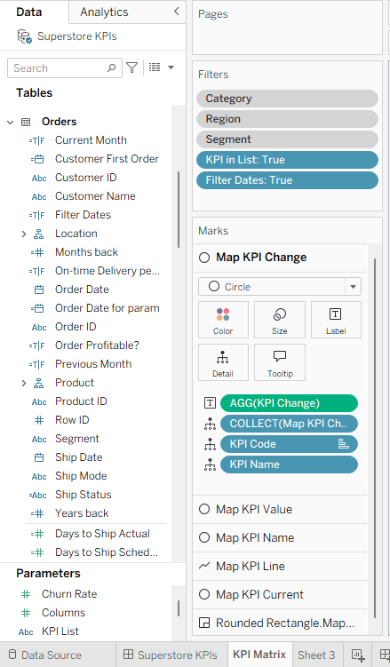
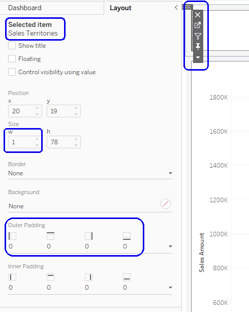
And this is where you have to look out for the actual results. By pointing Tableau at a specific base table, we are limiting the use of the dimension to that table only – even though the selected dimensions are related to two or more tables:
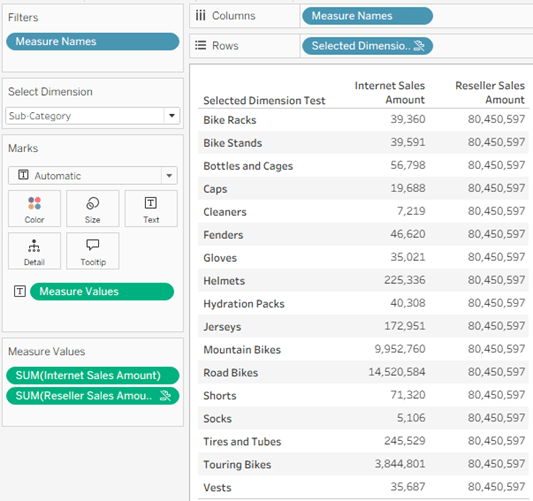
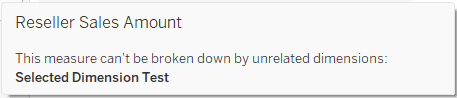
In the screenshot I have selected the Sub-Category dimension, but in the data pane it is applying to Internet Sales Amount only, even though it is related to Reseller Sales as well – because I “pointed” Tableau at Internet Sales with my dummy row in the calculated field. Note that Reseller Sales Amount even has the icon ![]() indicating a broken link, and hovering over it displays a message:
indicating a broken link, and hovering over it displays a message:
Conclusion
Dimension switching in a multi-fact model works, just as it does in the old relationship model with one base table, as long as Tableau is told explicitly which base table to use. However, there is currently no improvement in the capabilities, so you can’t switch dimensions in a single worksheet and display measures from multiple fact tables. Maybe that will come in a future iteration. And now you know how to “force” Tableau to choose a base table for the dimensions when necessary.