Tag: Desktop

  • Text Bars

    Text Bars

    The most memorable Tableau trick that I encountered at DataFam Europe this year was something that I already knew of (vaguely), but seeing it twice brought it to my attention and now it won’t be pushed to the back of my trick cupboard again.

    This was presented both by Andy Cotgreave in DataFam Slam (minute 36:00), and by Nhung Le in Tremendous Tableau Tips (minute 20:00), with different context (you need to register for Salesforce+ to see the videos). I’ll discuss just the technique, and what it can be used for.

    So what are text bars? You can use a text field in Tableau to create a horizontal bar, and also manipulate its length using the data. This is possible due to the existence of the Unicode characters “█” (U+2588: Full Block) and “▒” (U+2592: Medium Shade).

    Let’s say we want to display our count of orders per customer, which is not a very large number, in bars within the table header. We create a calculated field:

    REPLACE(SPACE([No. of Orders]), ” “, “█”)

    The SPACE function returns a number of spaces as defined in the parameter that you give it (up to a limit, of course – don’t try to exceed 100 or so), and then we replace them with the Full Block character. The result is a text bar, that can be placed as a header in the rows of out worksheet:

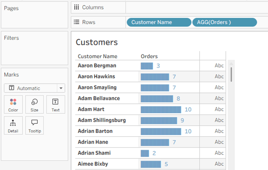
    The label at the end is a simple concatenation:

    REPLACE(SPACE([No. of Orders]), ” “, “█”) + ”   ” + STR([No. of Orders])

    Another option is to use the text bar to display a percentage value, though it has to be rounded. In this example I am rounding to the nearest 5%, and filling up the 100% with the partially shaded bar:

    REPLACE(SPACE(ROUND(MAX([Profit Ratio], 0) * 20)), ” “, “█”)
    +
    REPLACE(SPACE(ROUND(20 – MAX([Profit Ratio], 0) * 20)), ” “, “▒”)

    Note the MAX function, which I am using to eliminate negative values.

    The end result is below. No concatenated label this time, because formatting the percentage value to a string is complicated, so I simply added the Profit Ratio value as the next field. The Segment field is there to show that the bars are within the header.

    Andy showed how text bars can be used within tooltips (before Viz in Tooltip was released), but I’m sure the community will think up other implementations, apart from the simple spicing up of a table that I showed, and probably using other special characters as well.

  • How to Un-nest Arrays using Tableau

    How to Un-nest Arrays using Tableau

    This is a revised copy of my original post in the Tableau Community blogs from 2023.

    Over the years I’ve encountered many examples of data that includes arrays of values within a single field – either in JSON format or as simple text, such as this:  [[4,0],[5,3],[7,3],[8,0],[4,0]]

    Usually the data can be un-nested using SQL or JSON functions into a set of separate rows, which can then be linked to the original data table as a separate table. However, a few years ago I was working on a system with no such option: the original data was in ElasticSearch, and our ODBC driver didn’t enable any un-nesting functions. And we needed to get the row data from the arrays.

    It turns out that Tableau can do this quite easily. Here is the solution:

    1.      Build a regular data source from your table, with the array field as normal text. In the example, it’s called [Shape Coordinates].

    2.      Create a table of numbers from 1 to N, with N being larger than the maximum size (number of items) in your array. The table can be in Excel, the database, or any other format. Add the table to the data source and join it to the data table using a relationship, using a full cartesian join – meaning that you create a relationship calculation with an identical value (I use 1) on each side.

    Note – the example here unnests a two-dimensional array. Each value has any number of pairs of coordinates, specifying a shape to be drawn on the page. The real data actually had pairs of real coordinates (latitude/longitude) specifying a GPS track.

    Now, for every row of data we have numbers from 1 to N in the corresponding table, which we will use to find the 1st, 2nd, 3rd, and so on… members in the array, by splitting it using the commas and brackets in the string. I would have loved to use the SPLIT function here, but it doesn’t accept a field or variable as a parameter, so we’ll use FINDNTH instead:

    3.      We find the start of each member: Start → FINDNTH([Shape Coordinates], “],[“, [Num]-1)

    Note that I’m looking for “],[“, because the comma alone is not enough – it will find the split between each pair as well.

    4.     The end of each member: End → FINDNTH([Shape Coordinates], “],[“, [Num])

    5.      The length of each member is basically End minus Start (the last member has no End, so I use a maximum value, longer than any string that I would expect:

    Length → IF [Start] > 0 THEN

       IF [End] > 0 THEN [End] – [Start]

       ELSE 20

       END

    END

    6.      Now the actual split: Split → MID([Shape Coordinates], [Start], [Length])

    7.      And clean up all the brackets and commas: Pair → REPLACE(REPLACE(REPLACE([Split], “],[“, “”), “]”, “”), “[“, “”)

    I’ve now unnested my array and retrieved an ordered list of values for each row of data. In this case the values are pairs of numbers, but they could be any type of data. If there are less than N members in the array, the Split and Pair fields return Null and can be filtered out. The data looks like this:

    8.      I split the pairs into X and Y coordinates:

    X → FLOAT(SPLIT([Pair], “,”, 1))

    Y → FLOAT(SPLIT([Pair], “,”, 2))

    9.      Now I can visualize my geometric shapes on a worksheet using polygons:


    Discussion

    This technique works, and caused no performance issues on a dataset that included tens of thousands of records, with each array having up to 50 pairs of latitude/longitude values.

    The “normal” solution would unnest the arrays using SQL, thereby creating a new data table with a large multiple of the original number of records, though with very few fields (ID, X and Y). If you are visualizing only a small number of records at a time, I would expect much better performance from my technique, which calculates the array data on the fly and only for the specific records you need. However, if you are filtering or aggregating by array data from thousands or millions of records in one view, a pre-calculated table would probably be much faster.

    The sample workbook is on Tableau Public:  https://public.tableau.com/app/profile/dan.chissick/viz/UnnestingArrays/UnnestingArrays

  • Why Tableau ?

    Why Tableau ?

    I’ve been working as a consultant for a Tableau Partner (and reseller) for over a decade, so I’ve been asked by potential customers many times: Why Tableau? Why should we prefer Tableau over its competitors – Power BI, Qlik, Looker, and various others?

    For the customers we have various answers, depending on the context – their requirements, size, deployment type, self-service, embedding, even the community support, and more. But why am I a Tableau “freak”? And so many others in this same community? What makes Tableau special, compared to the other top-end visualization tools?

    I’ve been working in data visualization since the nineties, first with Panorama (which, back then, was excellent) and then touching upon various other tools. When I tried out Tableau for the first time (around 2014) it was just a test in my spare time, and nothing happened. But about a year later I got my first project, so I had to dig deeper, and I was hooked.

    So what’s the difference? There are two major factors.

    First – all the visualization tools I had used before, and most of those I’ve seen since, have a similar method for creating a chart (“worksheet”, “widget”, or whatever): You choose the type of chart from a menu, connect it to your data model, and start setting the properties – which dimension is on rows (or “categories”), what measure to display, bar color, line thickness, label font, and so on. If you need a different type of chart, you get a new set of properties.


    Power BI chart selection
    Quicksight charts

    Tableau, from the beginning, was different. Every worksheet (for a chart or table) uses the same set of definitions, or cards: Columns, Rows, and Marks. You have several types of marks, but almost all of them have the same sets of properties – Color, Size, Text, Tooltip, Detail (and sometimes Shape, Path and Angle). The “Show Me” pane is just a set of default configurations, not really a chart selector, and I rarely use it.

    This means that once you understand the interaction between rows, columns and marks, you can create almost anything – and I mean anything, not just data visualizations, but also artwork and games, for example. There’s an inherent flexibility that gives Tableau an advantage over other tools, both in speed of development and in the ability to iterate and “play around”, because you don’t have to select or switch the type of object that you’re working on all the time, and you’re not limited to their predefined attributes.


    The Tableau interface

    The second factor is Tableau’s calculations. I agree that all BI tools have the ability to create calculated fields, but Tableau has a great combination of a simple interface – everything is in one place, easily accessed and edited – and a large array of options, from the simplest arithmetic to Level of Detail functions and Table Calculations. Once you gain a basic understanding of how it works – aggregate and row-level, and a few other basics – it’s very easy to use, and also very powerful. 


    Try creating this without Tableau

    Some people don’t get it. They’ve been using Power BI or another competitor’s software for years, have difficulty switching to a Tableau mindset, and will always prefer their original tool. But I believe that Tableau’s greatest advantage is still the basic development interface, that allows you more flexibility and speed of implementation compared to its competitors.

    Of course there are other features. In Desktop – you can create a flexible data model from almost anything, and then manipulate the data in various ways. Dashboard design and actions. Beyond it – Tableau can be used by a lone researcher or by an enterprise with 50,000 users, online or offline. Tableau Public, of course. APIs, embedding, and more. The Community.

    But as Andy Kriebel, in my opinion the greatest Tableau guru of all time, recently wrote:

    Tableau is not Agentic Analytics
    Tableau is not Tableau Next
    Tableau is not Tableau Cloud

    Tableau is Tableau Desktop

    What he meant was that the core of Tableau is still the basic development interface, of which Tableau Desktop is the main component. You can add features around it, but without Desktop it won’t be the same. And Desktop is what makes Tableau the best.

  • Workbook Locale

    Many times, I’ve encountered Tableau developers struggling with the date formatting in their workbooks, mostly as it defaults to the US format (mm/dd) instead of what they need – and then they waste time setting custom formats for date fields in various worksheets.

    The solution to this, and one of the lesser known features of Tableau Desktop, is the “Workbook Locale” setting, located under the “File” menu.

    The “Automatic” option defaults to your computer’s regional settings, but if you select “More” you can choose your language, and then all date and number formats in the workbook will use that setting by default.

    Even less known is the fact that this setting, at the workbook level, overrides any other regional locale. So if you save the workbook with a locale other than “Automatic”, the date and currency format is fixed, even after publishing to Tableau Server or Cloud.

    The order of precedence is listed below, and documented here:

    1. Workbook locale (set in Tableau Desktop)
    2. Tableau Server User Account language/locale settings
    3. Web browser language/locale
    4. Tableau Server Maintenance page language/locale settings
    5. Host computer’s language/locale settings

    The bottom line – you can control everything using Workbook Locale, so use it, unless you need varying formats for users in different languages or countries, of course.

  • Find in Data Pane

    Tableau always release new versions with a list of new and exciting (or not so) features, such as this, but there are sometimes really helpful additions or modifications that are unlisted, and even undocumented.

    I always start using a new version of Tableau Desktop almost immediately, because as a consultant I have to keep up to date. So when version 2025.2 came out I was working with it within a day, and suddenly saw a new menu entry:

    "Find in Data pane"

    My first reaction was “Is this what I think it is?”.
    My second was to click on it.

    It’s definitely what I thought. No more searching for a field from your worksheet in the Data pane, in order to check the formula. Click on “Find in Data pane” and it finds the field immediately.

    For me, as a consultant, this is a game-changer. I spend hours with my clients, when something isn’t working as they expect, checking their calculated fields, and we always start from the worksheet rows, columns, and marks. Now we can save time and jump straight to the field, without scrolling or typing in the search box.

    Unfortunately this is currently relevant only for Tableau Cloud users, because Server doesn’t have a 2025.2 version, but it’s a great new feature. And I haven’t found it in the documentation yet…