Recently someone noted that Tableau tables don’t do a great job displaying long text fields – the row height can be adjusted to accommodate any number of lines of text when it is wrapped, but it is fixed for the whole table, not dynamic per row. Look at the example below (just some old tweet dataset that was lying around), and you can see that all rows have exactly 3 lines, so in many cases there is blank space, or an overflow (two dots at the end):

Is there a solution? Built-in there isn’t, but a couple of calculations can certainly help and format our text table more efficiently. This is how it’s done.
First, I define an integer parameter called “Text length” and set the value to 40. I’ll use it later.
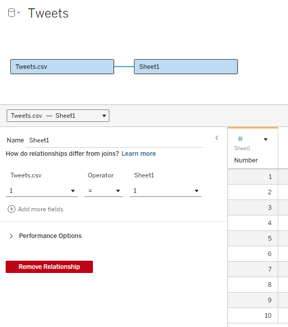
Now I need to add an “expander table” to my data source. This is a simple table (I usually use Excel) with a column of numbers, from 1 to as many as needed. In the example I don’t expect to display more than 10 lines of text, so I limit the table to 10, but it can be a lot more. The relationship between the table and my data table is set as a full cross-join: 1 = 1
What I’m going to do now is split the text field into separate lines, by finding the first space after every N characters (N being my parameter) and cutting the text at that point. For this I use 3 calculated fields:
Cutoff N (this marks the first space after N * Number characters (or the end of the text)
IF FIND([Text], ” “, [Number] * [Text length]) = 0 THEN LEN([Text])+1
ELSE FIND([Text], ” “, [Number] * [Text length])
END
Cutoff N-1 (this is the previous space)
FIND([Text], ” “, ([Number] – 1) * [Text length])
Text N (cut out the text from [Cutoff N-1] to [Cutoff N]
IF [Number] = 1 THEN LEFT([Text], [Cutoff N])
ELSE TRIM(MID([Text], [Cutoff N-1], [Cutoff N] – [Cutoff N-1]))
END
Note that I’m using the [Number] field from my expander table to define the line number (N), and the number of characters in each line of text depends on the [Text length] parameter.
Place [Number] on rows, then [Text N], and I get my table with the text field split nicely into lines:
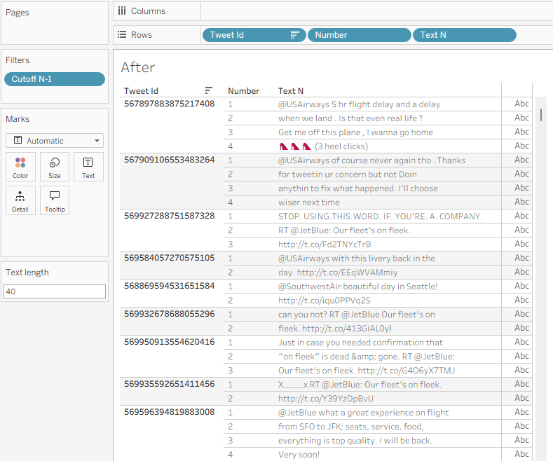
I can use the Text length parameter to play with the field width, and see what it looks like with different values.
A few additional formatting steps:
- Uncheck “Show Header” on the Number field in Rows.
- Format the Borders so the lines within the text disappear.
- Fine-tune the row shading.
- If there’s no field after Text N, switch the mark type to Polygon so the “abc” disappears.
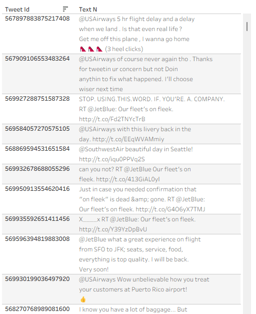
And I have a formatted text table:
Now let’s say that I need some data field to the right of my text – in this example I’ll use “Retweet count”. If I just add the field, it will display the same value for each line of text, so I need to use a table calculation:
Retweets
IF FIRST() = 0 THEN SUM([Retweet Count]) END
I can add this, and then Edit Table Calculation using the following settings:
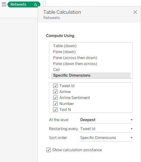
This enables me to show the value only for one row, and my finished table, with the additional columns, looks like this:
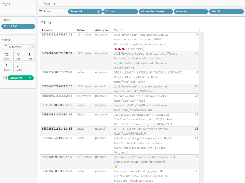
Summary
The data in this sample dataset isn’t varied, with most tweets being around the same length, but you can see how a flexible number of text lines per data row can improve the look and feel of a Tableau table. So it’s not impossible – you need just a relatively simpke workaround. And that’s part of the power of Tableau: with a little imagination and some calculated fields, you can tweak your visualizations and solve many display problems without any coding.
