Author: dchissick

  • Filtering Multiple Data Sources

    Filtering Multiple Data Sources

    This is a revised copy of my original post in the Tableau Community blogs from 2024.

    Back in the day (before 2020.2), you could add worksheets from different data sources to a dashboard, define a filter from one of them, “Apply to selected sheets”, and it would automatically filter the other sheets using blending.

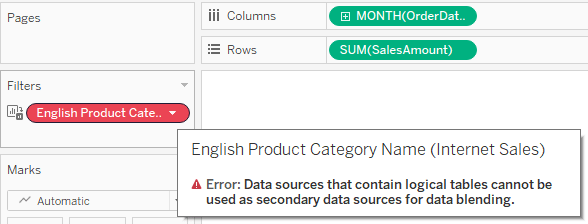
    Then came relationships, which enabled us to create more flexible and efficient data sources. However, the filtering option was suddenly lost, because the secondary data source in a blend cannot include a relationship. When you try to apply a filter from one worksheet to another, and both are based on relationships, the second is suddenly disabled (grayed out or empty), and when diving into it you see the dreaded message:

    So we started creating workarounds – and especially using parameters as filters, with all their disadvantages: no “All” option, no multi-select, no “relevant values”. And telling customers (or users) that on dashboards using multiple “advanced” data sources their filtering options were limited.

    And then, after almost 4 years of dithering around this, I had an epiphany. Looking around a bit (using mostly Google Search, of course) I couldn’t find anyone who had implemented this sort of solution, or at least written about it.

    So here are the sample workbook:
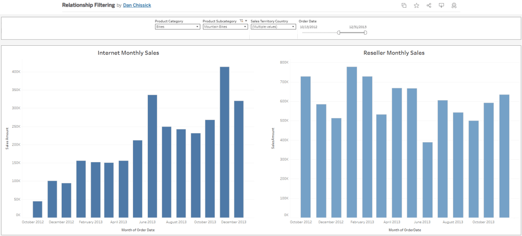
    and the explanation:

    The data is based on the Microsoft AdventureWorksDW database. There are two data sources with relationships to various dimensions: Internet Sales and Reseller Sales. Both have similar data and some common dimensions.

    Basically the idea is to create a supporting data source for each dimension used as a filter, with no relationships. Joins are possible, of course – if you want to create a hierarchy, for example.

    In this case we have three supporting data sources:

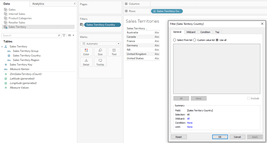
    ·        Sales Territory (including a hierarchy of Group, Country, Region)

    ·        Product Category (including Category and Sub-Category)

    ·        Dates – this actually contains all dates within the relevant data range, and is based on a separate view from the actual data. I named the date field “Order Date” because this is the field’s name in the main data sources.

    Now create a dashboard and add worksheets from the two main data sources. I’ve added two bar charts.

    For the Sales Territory Country filter (for example), create a worksheet with only Sales Territory Country on the rows. Add the same field as a filter as well (select “Use all” for now).

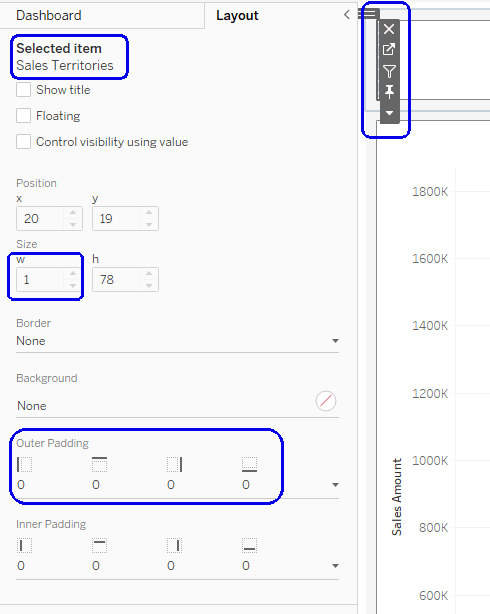
    Go to your dashboard, and drag the worksheet onto it. Then make it disappear: set “Outer padding” in the layout to zero, and the height and/or width in pixels to 1.

    In the worksheet menu select Filters –> Sales Territory Country, and the filter will appear. Place it wherever you want, Apply to Worksheets –> Selected Worksheets, and select the worksheets with the data.

    And there it is – the filter affects both bar charts, using the Sales Territory data source, which has no relationships, as the secondary data source for the filter.

    Using the Product Category data source and another hidden worksheet, I created a couple of additional filters for Category and Sub-Category.

    As for the dates, the process is the same, and I can use any type of date filter – relative, range of dates, year, etc. It’s important for the independent Dates data source to include all possible dates in the actual data sources, so the blending works properly.

    To summarize – the finished dashboard has charts from two different data sources with relationships and multiple logical tables, filtered by common dimensions with little effort. The supporting “dimension” data sources can be re-used, so this is a relatively simple workaround for organizations working with many complex data sources and seeking to combine them within multiple dashboards.

  • Find in Data Pane

    Tableau always release new versions with a list of new and exciting (or not so) features, such as this, but there are sometimes really helpful additions or modifications that are unlisted, and even undocumented.

    I always start using a new version of Tableau Desktop almost immediately, because as a consultant I have to keep up to date. So when version 2025.2 came out I was working with it within a day, and suddenly saw a new menu entry:

    "Find in Data pane"

    My first reaction was “Is this what I think it is?”.
    My second was to click on it.

    It’s definitely what I thought. No more searching for a field from your worksheet in the Data pane, in order to check the formula. Click on “Find in Data pane” and it finds the field immediately.

    For me, as a consultant, this is a game-changer. I spend hours with my clients, when something isn’t working as they expect, checking their calculated fields, and we always start from the worksheet rows, columns, and marks. Now we can save time and jump straight to the field, without scrolling or typing in the search box.

    Unfortunately this is currently relevant only for Tableau Cloud users, because Server doesn’t have a 2025.2 version, but it’s a great new feature. And I haven’t found it in the documentation yet…

  • Click on “Use Extract”

    One of the infuriating behaviors I encountered early on with Tableau was when I was working with an extracted data source in Desktop. I would be creating worksheets, calculated fields, and dashboards, and then I needed to check something in the data source.

    So I went to the Data Source page, dug into the structure, found what I wanted – but I didn’t change anything. However, when I wanted to return to my worksheet, Tableau decided that something had changed, and started the dreaded extract refresh…

    What do you do in this situation? Wait 10 minutes for it to finish? Cancel and remain stuck in Live mode?

    There’s a solution:

    Cancel.

    If the worksheet starts processing in live mode, Cancel again.

    Now go to the data source’s right-click menu, and check the “Use Extract” option. Your extract still exists, so you are returned instantaneously to extract mode as if nothing has happened. Problem solved.

    I’ve seen this happen literally hundreds of times, especially while working with others, and most developers think they have no option except wait for the extract to finish. So I hope this small tip helps someone…

  • How it all started

    How does one become a BI developer?

    These days, you can study BI courses in University, or take various technical courses such as the ones we teach at Naya College. But back in the 90’s there was nothing. No-one knew what BI was.

    My journey started in high school (1982-85), where I studied computers (the subject was called “Automatic Data Processing – Systems”). We learnt Pascal, Fortran, and mostly Cobol, and my final project was an ERP system for my father’s brush factory. Unlike most of the projects in the class, this one went into production within a few months, and kept working until I upgraded it to Microsoft Access 12 years later!

    After my army duty and a B.A. in Mathematics, I discovered that there is no real work in Maths, unless you want to become a teacher (no way) or stay in academics (not really). So a friend of my dad took me in for a trial as a software programmer, and there I stayed for the next ten years. But that wasn’t BI yet…

    I was working at Blades Technology Ltd., a company manufacturing blades for aircraft engines, and doing various programming jobs, mostly in Access. One day, a marketing guy from a software company came around to display his product – Panorama, a tool for creating data visualizations. No-one was impressed by the demo, but he agreed to leave us a copy of the software, so we could test it on our own data, and as the junior in the IT department it landed on me.

    Blades Technology Ltd.

    I was hooked. I connected to some of our marketing data, created charts, and showed how quickly we could now analyze the data. The company bought Panorama licenses, I was put in charge of the project, and soon we had a data warehouse and I was an expert in the field. I continued developing applications with Access until I left there, but my official position by then was BI Team Leader, and I’ve never looked back.

    There are lots of additional BI stories from my time at BTL, but the most significant one was probably one of the first.

    Our ERP was Priority, an Israeli system that is still around and has a large slice of the market. At some point, I was tasked with analyzing the changes in customer orders that our company was receiving. These were loaded automatically into Priority through some sort of communication interface (this was in 1996, nowadays it’s called an API), and the VP of Sales suspected that there were too many changes from day to day, and they were playing havoc with our production planning.

    Priority wasn’t storing history, so I created the beginnings of a data warehouse, and started storing daily snapshots of the customer orders. Using Panorama to visualize the data, within a week we knew that the automatic data was deeply flawed, and orders were changing drastically from day to day – so that yesterday you could have an order for 300 blades of a certain part no. to be supplied by August, and today there would be just 100, but due in June.

    More importantly, we could now prove it. Not long after that, the VP Sales travelled to visit our customer in France, laden with printed charts from Panorama, so he could show them the data. Incredibly, they were just as astounded by the data as we were. Apparently they had an automated planning system that sent the orders through the API without any control, and it was causing this whole mess. In time the problem was fixed, but more importantly – the data warehouse and BI had proved its worth.

    And if I could give you just one takeaway from these stories: if you’re selling BI software, always enable your customers to use it and analyze their own data.