Category: Stories

  • Judging Iron Viz 2026

    Judging Iron Viz 2026

    The results are in for this year’s Iron Viz qualifiers, so I thought I could share some thoughts about the judging process, and of course about my involvement in it.

    https://www.tableau.com/blog/top-10-qualifiers-iron-viz-2026

    The judges for the Iron Viz qualifiers are about 30 volunteers from the current year’s cohort of Ambassadors and Visionaries, obviously not including those who are actually participating. This year I volunteered for the second time (previous was in 2024) – I can’t take part in any case because of the legal constraints that limit Iron Viz entrants to residents of only 32 countries in the world (more about that here), so judging is a good way to be involved.

    The vizzes are screened by the Tableau team to make sure that they comply to the minimal standards, such as the chosen theme (this year it was “Food and Drink”), and then each entry is assigned to 3 random judges. Many of the entrants publicize their work immediately after submitting, but we are asked to try and ignore the social media noise before judging, for obvious reasons. I was assigned 11 vizzes, but I had to decline one of them, as it was created by a colleague from my company and I had even given feedback on the content, so it was re-assigned to someone else.

    We had more than a month from receiving the anonymized vizzes until our deadline, so there was ample time. I invested at least half an hour on each – first investigating it as a viewer, then opening the workbook and seeing how it was created, including data sources, calculations, worksheet structure, and actions, and then assigning the scores and adding brief comments. When I had finished with all of them, before submitting all the scores into an online form, I also looked at the final ranking and evaluated if it reflected my general impression of the vizzes – because sometimes you can get immersed in the small details and scores, without seeing the big picture: which viz is the best?

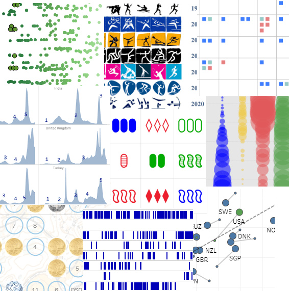
    I was impressed by the amount and variety of data collected by most of the participants. Most of the vizzes were based on multiple datasets with a wealth of data about their subject, and I’m sure a lot of effort went into collecting this data, before even starting on the design.

    I have to note that most of the subjects did not interest me at all – I’m the total opposite of someone you would call a “foodie”, and I don’t drink almost anything except water. Some of the data, and even the food and drink names, could have been pure fiction, and I wouldn’t have known the difference.

    I am not going to divulge any recognizable information about the vizzes that I judged, of course, only my general impressions. Overall, of the 10 vizzes, I would have said that one was of beginner level, 7 were good to very good, and two were outstanding.

    We judge all the vizzes by awarding scores from 0 to 5 on the well-publicized criteria: Analysis, Design, and Storytelling. This is what the scores that I awarded looked like:

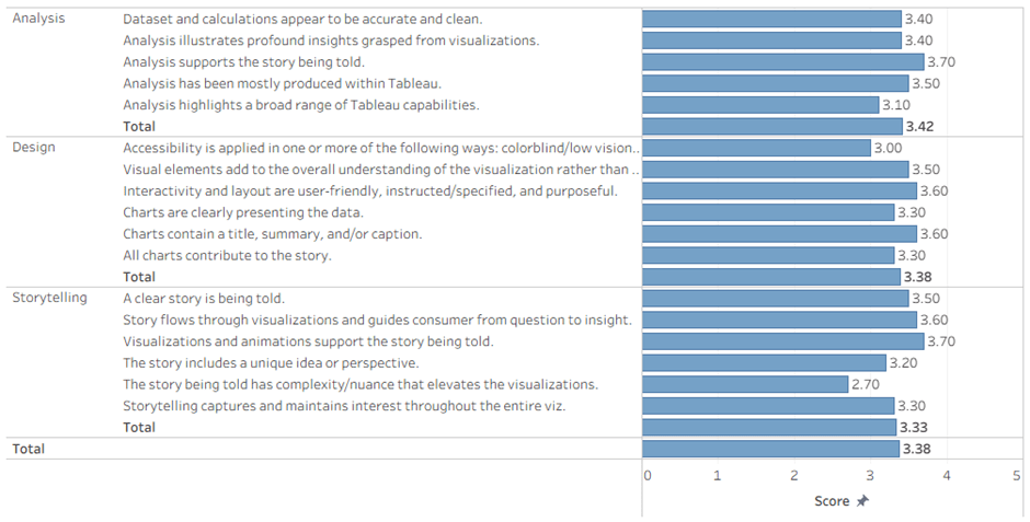
    Not much to be learned from this: most vizzes correlated well with their story, only the good ones had some complexity/nuance, and accessibility is not on everyone’s mind.

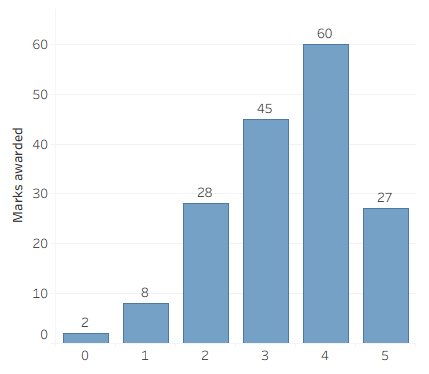
    Another way of looking at it:

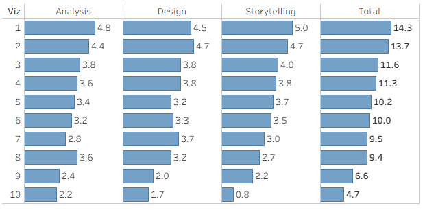
    And the final results (anonymized Viz number), out of a maximum of 15 points:

    My thoughts about some of the judging criteria:

    Analysis

    • Viz topic aligns with the contest theme.
      • This one is obvious, and you don’t get a score for it – just True or you’re out.
    • Dataset and calculations appear to be accurate and clean.
      • This is where I check the data model: are there lots of data sources with disorganized names, or is there a nicely structured data model? And are the calculated fields well named and structured?
      • Errors cost points here – if an action or calculation performs incorrectly.
    • Analysis illustrates profound insights grasped from visualizations.
    • Analysis supports the story being told.
    • Analysis has been mostly produced within Tableau.
      • I understand this as meaning that if you’re calculating aggregates in SQL, or bringing in coordinates for a Sankey chart from Excel, you’re not producing analysis in Tableau.
    • Analysis highlights a broad range of Tableau capabilities.
      • Here is where I gave more points for using Tableau’s visual features: interesting chart types, dashboard actions, show/hide buttons, DZV, and even recursive parameter actions (my favorite, of course).

    Design

    • Accessibility is applied in one or more of the following ways: colorblind/low vision (contrast) friendly palette, limited use of images to convey text, font size 12pt or larger.
      • I deducted points mainly for tiny fonts (there were lots of those), and a little for color palettes – it’s easy for me to judge, because I am slightly color blind.
    • Visual elements add to the overall understanding of the visualization rather than distract.
      • Don’t use charts if they don’t convey any information.
    • Interactivity and layout are user-friendly, instructed/specified, and purposeful.
    • Charts are clearly presenting the data.
      • If I need to investigate a chart for more than a few seconds in order to understand it, you lose points.
    • Charts contain a title, summary, and/or caption.
    • All charts contribute to the story.

    Storytelling

    • A clear story is being told.
      • Don’t just display data – you need to tell a story. Actually I’m not very good at this, but I can recognize a good story when I see one.
    • Story flows through visualizations and guides consumer from question to insight.
    • Visualizations and animations support the story being told.
    • The story includes a unique idea or perspective.
    • The story being told has complexity/nuance that elevates the visualizations.
      • I looked for something special in the story: is it a bare analysis of the data, or are you investigating (or making me investigate) and discovering something?
    • Storytelling captures and maintains interest throughout the entire viz.
      • This is the easiest: was I captivated from the moment I first opened the viz, or did I lose interest at some point? The first impression was most important here.

    So what about the results?

    The viz that I ranked 3rd was in the top ten.

    The viz that I ranked 2nd was in the top three, and qualified its creator to battle on stage in Iron Viz 2026.

    And the viz that I ranked 1st ….  nothing. Obviously two other judges didn’t like it as much as I did, or maybe Tableau have other considerations that also affect the final rankings.

    Summary

    Judging Iron Viz is quite a bit of work, but it’s one way for us Ambassadors to give back to the community. It definitely improves your critical thinking, challenges you to give constructive feedback, and of course it’s fun. Even the discussion within the closed forums among the judges is interesting. I’ll definitely do it again, if I have the opportunity, and huge thanks to Katy Clarke from Tableau who led the process and coordinated everything.

  • DataFam Europe 2025

    DataFam Europe 2025

    Note – all the links to session recordings go to Saleforce+, you need to register (for free) in order to watch them.

    Preparations

    I was a speaker at DataFam Europe 2025, which was held in London on 2nd-3rd December, so from my point of view the event started a long time in advance.

    The news about DataFam Europe was only released in September, and almost immediately the applications to speak were opened, on a very short timeline – from 16th to 29th September. I’m sure it’s not a coincidence that Agentforce World Tour London was held on December 4th, and that probably forced the schedule. Having spoken in 2024 I was well acquainted with the process, and to hedge my bets I sent in three different applications, all of them new. This involves filling in a rather long form, with the important parts being the title, abstract, and “Why should this session be presented?”. I knew exactly what subjects I wanted, but I used some GenAI to generate a list of catchy titles for each based on the abstract, and then chose and modified the best one. I then used it to refine the abstract as well.

    My application was approved very quickly (I was informed on October 8th), so I had almost two months to prepare the presentation. Tableau always assign you a “Content Owner” who makes sure you’re on track, but my previous experience had been that they fully trusted us, the community speakers, regarding the technical content, and didn’t ask to review it at all – which had surprised me the first time. This year I was contacted by a couple of Solution Engineers from Tableau a couple of weeks before the event, and we set up an hour to go over my presentation. Their feedback was really helpful, and I made a few changes, even though it was on a tight schedule. I don’t know if this was implemented for every community speaker, but it’s exactly what I would have expected, so it was very welcome.

    The Conference

    The action started with a meetup (nominally “Data + Women”, but open to anyone) at the Information Lab offices on Monday evening. This was mainly a gathering of data people chatting and playing games, where I caught up with quite a few online friends, and made some new ones as well. Notably, all the Tableau senior management who were in town also made an appearance.

    The Conference entrance

    Tuesday was conference day, and everyone appeared at Tobacco Docks – which is a relatively large venue, but a bit chilly (we were warned in advance). On the second day I brought the Tableau scarf that we received in our welcome bag last year (and it helped), but there wasn’t any similar swag this time. There was enough space so it didn’t become too crowded, but if you were looking for someone you could find them quite easily.

    I was the only attendee from Israel except for the Salesforce employees, but I connected with them at their presentations and we’re already continuing the conversations back at home. Apart from that I met many friends who I’ve encountered as an Ambassador over the past three years, some of them at my lowly level and others very famous in Tableau circles (various Andy’s, etc.), and the nice thing is that everyone in the community is treated as an equal, as has been noted many times before.

    Unlike last year, there was a pop-up shop with some nice branded stuff, at semi-reasonable prices, and I indulged myself. There were the usual partner booths, snacks throughout the day, and in general a very welcoming and friendly atmosphere.

    My loot

    After the sessions (more about that later) we had the evening reception, which was basically just a lot of people hanging around and chatting. No problem with that, of course, but at some point I just quit for a quiet fish & chips and back to the “hotel” at my sisiter-in-law’s house. Just a note for Tableau community managers – the huge Jenga game is a safety concern, you need to clear a 2.5m radius around it from seating options, because one day someone will get hurt!

    Wednesday was a shorter day, so attendees could travel home in the evening. I was staying anyway, so I was present when they packed up the shop and started giving away the remaining stock for free – which, IMHO, is an insult to those who bought the same items earlier at full price. That doesn’t mean that I didn’t take anything…

    The Keynotes

    There were three keynote sessions, with room for everyone (500 people?) to attend. First was the Opening Keynote, with the usual presentation by Tableau management. As usual for these days, the main presentation was mostly about AI and Agents. Then there was a great talk by Matthew Miller about some real Tableau work, on the humidity level in the soil for his trees (!), and a customer / community panel who said all the scripted things that were expected, but didn’t enlighten anyone in the community.

    I’ve read a lot of criticism (mostly on LinkedIn) about the direction, and I agree. The keynote seemed to be aimed at corporate executives who are thinking about purchasing Tableau (or upgrading to the AI capabilities), while most of the attendees seemed to be community members. Maybe the mix is different at TC, where there are thousands of attendees, but here it was the wrong audience.

    One phrase that I liked, also by Matthew Miller: “Accurate, actionable, analytical answers, for anyone, anywhere, at any time” (I hope I got it correct).

    Then there was DataFam Slam – basically an entertainment show pitting five Tableau employees against five community (DataFam) members with short Tableau tips, and the audience voting for each tip. For me it was mostly fun, but I’m sure some of the tips were new for many of the audience, and I’ve written in my previous blog post about Andy Cotgreave’s winning tip for the DataFam (lucky that he switched sides earlier this year).

    DataFam won, of course 😊

    On day two we had True to the Core (not recorded?), with Tableau’s senior management fielding questions from the audience. Last year I was the first to ask a question, but this time I just listened. Some of the questions were really insightful, and I felt that the answers were sincere – especially when the question was “What question do you not want to be asked?”!

    I’m not good at remembering this stuff (questions and answers), but I think Tableau (Salesforce) are trying to balance between maintaining and growing their core business – Tableau Core, which includes the DataFam community – while also catering for the Salesforce imperative, which is to increase adoption of Tableau (Next) within the 70%+ of Salesforce customers who don’t have Tableau, and can contribute a lot of revenue. If we keep that in mind, we’ll hopefully be able to thrive within both worlds.

    My Session

    I presented my session (“Tableau Multi-Fact Models: Insights, Issues, and Fixes”) on Tuesday afternoon, to a relatively full hall. The onsite technical team were very professional, and there were no glitches. Because it was a “Silent disco” format, where the audience had headphones for the audio, there was no real option for any interaction, which was perfect: I knew from the rehearsals that I was going to be just over the allotted 30 minutes, and I ran through my content very fast.

    On stage

    My aim was to present an overview of the multi-fact data model, that was released in Tableau 2024.2 and is now starting to be more widely used. I reviewed the history of the Tableau data source models, showed how the new features work, gave some tips on implementation (Insights), and ran through some residual bugs (Issues and Fixes) that will hopefully be fixed in the near future.

    Feedback was good, both from attendees that I don’t know personally and from fellow ambassadors (and a Visionary or two). I’m glad that I succeeded in enlightening some people, and I hope this will drive adoption of this model – and maybe push Tableau to invest a bit more in improving it.

    The recording is here.

    The Breakout Sessions

    Most of the time at the conference was spent attending the “breakout sessions”, 30 or 45 minutes each, with a choice of 3-4 different sessions in each time slot (easy compared to Tableau Conference, where you may have to choose between 20 at the same time). There were longer hands-on training sessions as well, but I chose to skip them, so as not to take a spot from someone less experienced, who could benefit more. They are usually really fun, but less intensive, and I know most of the stuff.

    On the first day, not by design, all the sessions I attended were focused more on Tableau Next and AI, and mostly presented by Tableau employees. At some point it became boring – and they even used the same demos, so I was seeing the exact same functionality twice. Fortunately, much of the content was relevant for me, because I have to understand the whole Tableau ecosystem in order to educate our customers and point them in the right direction. The progress being made with MCP is especially interesting, because it could enable integration between Generative AI and Tableau, without investing in Tableau Next or paying a steep premium for Tableau+ licensing. At the end of the day I decided that tomorrow I would attend only Tableau Core sessions.

    One of the MCP slides

    So on the second day I did a round of “real” Tableau sessions. The highlights:

    Tremendous Tableau Tips by Heidi Kalbe, Nhung Le and Tore Levinsen. Just a selection of tips, some well known, some less, but all interesting.

    The Secret Life of Tables by Agata Mezynska. A great session on how to make tables more attractive, and insightful, for the users.

    Agata on Stage

    Beyond the Boundaries of Tableau by Tristan Guillevin. Not content with his “simple” viz extensions, Tristan is planning new and exciting implementations on Tableau APIs not yet released.

    Co-Designing with AI by Pablo Gomez. Very relevant for old-school Tableau developers who want to use AI as a design assistant, not directly within Tableau.

    Of course I couldn’t attend every session that I wanted, so I prioritized the more advanced stuff over the fun, and I’m looking through some other sessions on Salesforce+.

    Summary

    Was the trip worth it? Definitely – but I was there on the cheap compared to most others: Speakers don’t pay for registration, I wasn’t paying for a hotel, and my employer payed for the flight.

    But ignoring the cost (or lack thereof), it was a good conference. Great networking, enough sessions for both the desktop and the AI crowds, and a constant feeling of community. I’ve heard from veteran conferencers that the community and content were better in the previous decade, but I accept that times are changing, and there’s enough to go around for everyone. I’ll make my bid for TC 2026 (much more expensive), and maybe I’ll be there. If not, we’ve been promised that there will be a DataFam Europe this year (2026) as well.

  • Tableau Support

    Tableau Support

    Most Tableau developers have little or no interaction with Tableau’s technical support, but as a partner consultant dealing with lots of customers, I have opened dozens of cases over the years. Here is a short history of the experience, and some tips for newbies.

    Back in the day, before the Salesforce acquisition in 2019, Tableau Support was quite good. Anyone could open a case, even without a Tableau login, and once you traversed the initial questions trying to direct you to existing answers – or if you had the direct link – there was a comprehensive form to fill in. This included lots of technical details: type of problem, version, operating system, and the like, plus space for a short description, a long one, the urgency of the case, and files to upload.

    Responses were relatively quick, and they usually knew their stuff. Sometimes the first response was by email, and sometimes on the phone – I even had the local number through which the calls were routed saved on my mobile.

    After the acquisition the quality of support dropped significantly – both in my opinion and what I heard in the community. Some cases got no response at all, others were left hanging, and there was pessimism all around.

    During this period, support switched to Salesforce, and you could only open a case after logging in to Salesforce and connecting to your Tableau account through there. That made opening cases more difficult, because many small customers (and some large ones) don’t bother with all the configurations on their Customer Portal. Luckily we have a partner account, so in many cases I open a case through our account for a customer, especially if I have direct access to their Tableau environment (because the call will come in to me, of course).

    However, the support experience started improving. A lot. Today Salesforce Support is, in my opinion (again), significantly better than it ever was, and better than the old Tableau support. Some parts of the process are different, but the responses are faster, and definitely very professional. Some examples:

    • I opened a Severity 2 (urgent) case for a bug that was a show-stopper for my customer, and received a phone call within an hour. They already had a similar problem logged, and within a day we held a short session to confirm, and my report was added to the original. Unfortunately it hasn’t been fixed yet, but that’s a product issue, not support.
    • Recently we had a total outage on a customer’s cloud site, where no-one could view any dashboard. I opened a Severity 1 (critical) case, and received a phone call even before I had added the technical details. The support rep stayed with us for 3 remote sessions over the next 24 hours, until we found the root of the problem (which was caused by a the customer’s network security).
    • Another small but irritating bug that I opened with Severity 3 was easily reproduced, and fixed almost immediately, in the next patch: opened on 7 July, fixed in version 2025.2.1 (22 July).

    The Process

    So how does it work now?

    First, you need to be logged in to your Salesforce account and linked to your organiztion, and then you can open Salesforce Help (https://help.salesforce.com/s/cases). There you see a window with the “Ask Agentforce” option:

    The “Ask Agentforce” window

    Clicking opens a chat window, and I simply ask the agent to open a case, supplying as many details as possible. The agent asks some follow-up questions, and then creates a case.

    In the chat you can’t supply a long a detailed description, add lots of technical details such as version, or upload any files. So immediately after the case is opened, open the case page (it opens automatically, or you have a link in the automatic email you receive) and add a comment and any files. You can also respond to the email, and that appears as a comment as well.

    Responses are quick, by phone and email, and I have the current incoming number (from the UK) on my mobile. Obviously they don’t know everything, but there seems to be a good knowledge base – in a recent case they couldn’t find the answer, so I asked on the forums, and was assisted by Diego Martinez (Tableau Visionary) and his memory of a previous case. In such a scenario it’s important to ask Support to add the additional knowledge to their KB, so it will be easier for future customers, and they were responsive to my request to do so.

    Feedback

    I still have an issue with the feedback, after the case is closed. In the old system we received a detailed survey asking about various aspects of the support – response time, representative’s knowledge, general satisfaction, and more.

    Now the survey focuses mostly on the AI agent, which is just for opening the case, and not on the support itself. There are just five questions:


    Part of the feedback survey

    So 40% (or more) of the survey is about submitting the case, which is maybe 5% of the process. There’s no real option for rating and providing detailed feedback to the technical support, and it could be improved. I always leave comments about the fact that they’re only asking about Agent Astro and not the support itself, and I hope someone is reading them.

    Summary

    Tableau Support (through Salesforce) are very good, and probably still improving. Don’t overload them with questions about functionality that can be answered in the forums (just moved to Salesforce Trailhead), but don’t be shy about opening a case for real issues. And if you encounter something that looks like a bug, start by trying to find it in the open issues site, and if it’s there click on the report button so it gets more traction. Only open a case if it’s not there.

    Report that you are affected by an existing issue

  • Why Tableau ?

    Why Tableau ?

    I’ve been working as a consultant for a Tableau Partner (and reseller) for over a decade, so I’ve been asked by potential customers many times: Why Tableau? Why should we prefer Tableau over its competitors – Power BI, Qlik, Looker, and various others?

    For the customers we have various answers, depending on the context – their requirements, size, deployment type, self-service, embedding, even the community support, and more. But why am I a Tableau “freak”? And so many others in this same community? What makes Tableau special, compared to the other top-end visualization tools?

    I’ve been working in data visualization since the nineties, first with Panorama (which, back then, was excellent) and then touching upon various other tools. When I tried out Tableau for the first time (around 2014) it was just a test in my spare time, and nothing happened. But about a year later I got my first project, so I had to dig deeper, and I was hooked.

    So what’s the difference? There are two major factors.

    First – all the visualization tools I had used before, and most of those I’ve seen since, have a similar method for creating a chart (“worksheet”, “widget”, or whatever): You choose the type of chart from a menu, connect it to your data model, and start setting the properties – which dimension is on rows (or “categories”), what measure to display, bar color, line thickness, label font, and so on. If you need a different type of chart, you get a new set of properties.


    Power BI chart selection
    Quicksight charts

    Tableau, from the beginning, was different. Every worksheet (for a chart or table) uses the same set of definitions, or cards: Columns, Rows, and Marks. You have several types of marks, but almost all of them have the same sets of properties – Color, Size, Text, Tooltip, Detail (and sometimes Shape, Path and Angle). The “Show Me” pane is just a set of default configurations, not really a chart selector, and I rarely use it.

    This means that once you understand the interaction between rows, columns and marks, you can create almost anything – and I mean anything, not just data visualizations, but also artwork and games, for example. There’s an inherent flexibility that gives Tableau an advantage over other tools, both in speed of development and in the ability to iterate and “play around”, because you don’t have to select or switch the type of object that you’re working on all the time, and you’re not limited to their predefined attributes.


    The Tableau interface

    The second factor is Tableau’s calculations. I agree that all BI tools have the ability to create calculated fields, but Tableau has a great combination of a simple interface – everything is in one place, easily accessed and edited – and a large array of options, from the simplest arithmetic to Level of Detail functions and Table Calculations. Once you gain a basic understanding of how it works – aggregate and row-level, and a few other basics – it’s very easy to use, and also very powerful. 


    Try creating this without Tableau

    Some people don’t get it. They’ve been using Power BI or another competitor’s software for years, have difficulty switching to a Tableau mindset, and will always prefer their original tool. But I believe that Tableau’s greatest advantage is still the basic development interface, that allows you more flexibility and speed of implementation compared to its competitors.

    Of course there are other features. In Desktop – you can create a flexible data model from almost anything, and then manipulate the data in various ways. Dashboard design and actions. Beyond it – Tableau can be used by a lone researcher or by an enterprise with 50,000 users, online or offline. Tableau Public, of course. APIs, embedding, and more. The Community.

    But as Andy Kriebel, in my opinion the greatest Tableau guru of all time, recently wrote:

    Tableau is not Agentic Analytics
    Tableau is not Tableau Next
    Tableau is not Tableau Cloud

    Tableau is Tableau Desktop

    What he meant was that the core of Tableau is still the basic development interface, of which Tableau Desktop is the main component. You can add features around it, but without Desktop it won’t be the same. And Desktop is what makes Tableau the best.

  • How it all started

    How does one become a BI developer?

    These days, you can study BI courses in University, or take various technical courses such as the ones we teach at Naya College. But back in the 90’s there was nothing. No-one knew what BI was.

    My journey started in high school (1982-85), where I studied computers (the subject was called “Automatic Data Processing – Systems”). We learnt Pascal, Fortran, and mostly Cobol, and my final project was an ERP system for my father’s brush factory. Unlike most of the projects in the class, this one went into production within a few months, and kept working until I upgraded it to Microsoft Access 12 years later!

    After my army duty and a B.A. in Mathematics, I discovered that there is no real work in Maths, unless you want to become a teacher (no way) or stay in academics (not really). So a friend of my dad took me in for a trial as a software programmer, and there I stayed for the next ten years. But that wasn’t BI yet…

    I was working at Blades Technology Ltd., a company manufacturing blades for aircraft engines, and doing various programming jobs, mostly in Access. One day, a marketing guy from a software company came around to display his product – Panorama, a tool for creating data visualizations. No-one was impressed by the demo, but he agreed to leave us a copy of the software, so we could test it on our own data, and as the junior in the IT department it landed on me.

    Blades Technology Ltd.

    I was hooked. I connected to some of our marketing data, created charts, and showed how quickly we could now analyze the data. The company bought Panorama licenses, I was put in charge of the project, and soon we had a data warehouse and I was an expert in the field. I continued developing applications with Access until I left there, but my official position by then was BI Team Leader, and I’ve never looked back.

    There are lots of additional BI stories from my time at BTL, but the most significant one was probably one of the first.

    Our ERP was Priority, an Israeli system that is still around and has a large slice of the market. At some point, I was tasked with analyzing the changes in customer orders that our company was receiving. These were loaded automatically into Priority through some sort of communication interface (this was in 1996, nowadays it’s called an API), and the VP of Sales suspected that there were too many changes from day to day, and they were playing havoc with our production planning.

    Priority wasn’t storing history, so I created the beginnings of a data warehouse, and started storing daily snapshots of the customer orders. Using Panorama to visualize the data, within a week we knew that the automatic data was deeply flawed, and orders were changing drastically from day to day – so that yesterday you could have an order for 300 blades of a certain part no. to be supplied by August, and today there would be just 100, but due in June.

    More importantly, we could now prove it. Not long after that, the VP Sales travelled to visit our customer in France, laden with printed charts from Panorama, so he could show them the data. Incredibly, they were just as astounded by the data as we were. Apparently they had an automated planning system that sent the orders through the API without any control, and it was causing this whole mess. In time the problem was fixed, but more importantly – the data warehouse and BI had proved its worth.

    And if I could give you just one takeaway from these stories: if you’re selling BI software, always enable your customers to use it and analyze their own data.