Tableau has many little quirks. With time you get used to them, but for new developers some of the small stuff can be very frustrating at first, and a nudge in the right direction always helps. So here’s one of them.
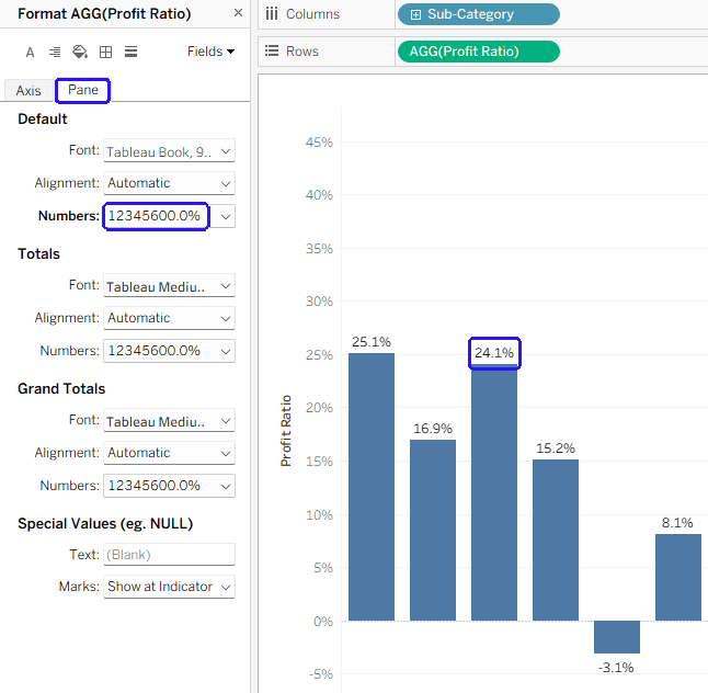
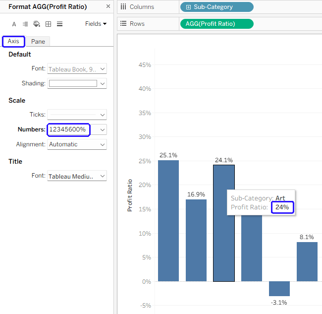
In Tableau charts, any numbers appearing in tooltips are formatted using the “Axis” format, and not the default “Pane” format. So if you want your chart label to show “24.1%”, and the axis to have 0%, 5%, 10%, etc., your tooltip will show “24%”, which is a bit strange. See the example below:
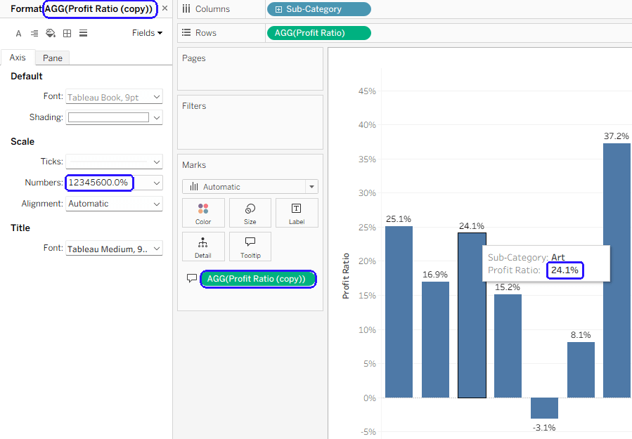
The best solution in such a scenario is to duplicate the relevant field, so basically you’re using two different fields – one for the label and axis, and another for the tooltip. Now you can set the axis format for the tooltip field (“Profit ratio (copy)” in the example below) without causing your axis to show unnecessary digits.
Is there a reason for this functionality? Logic says that the tooltip format should be similar to the label, not the axis (which is usually more “rounded”), but maybe there’s something hiding behind it. And there’s been an Idea (now on the Salesforce IdeaExchange) about changing it for 12 years…

Leave a comment