Category: Quick Tips

  • Incremental Refresh

    Incremental Refresh

    I’m actually writing this post because I encountered a small bug in Tableau’s incremental refresh setup, but it’s an opportunity to make a case for the functionality in general.

    At first, incremental refresh of extracts wasn’t very useful, because you could only add new data – either by a numerical or a timestamp field. It was nice if your large data table had only inserts, like log entries, but that’s not the case in most operational systems.

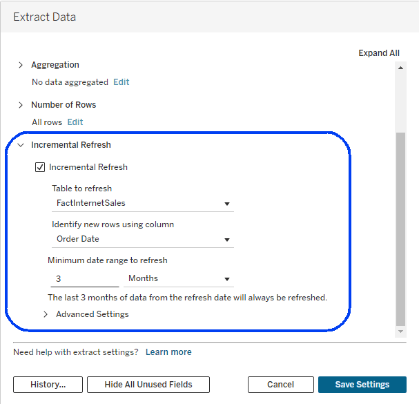
    This changed back in 2023, and now you can refresh an extract incrementally based on a date range, so all data within that range is replaced – thus enabling updated and deleted records to be modified in the extract. The limitation is that only one logical table in the extract can be defined for incremental refresh – all the others are still fully refreshed.

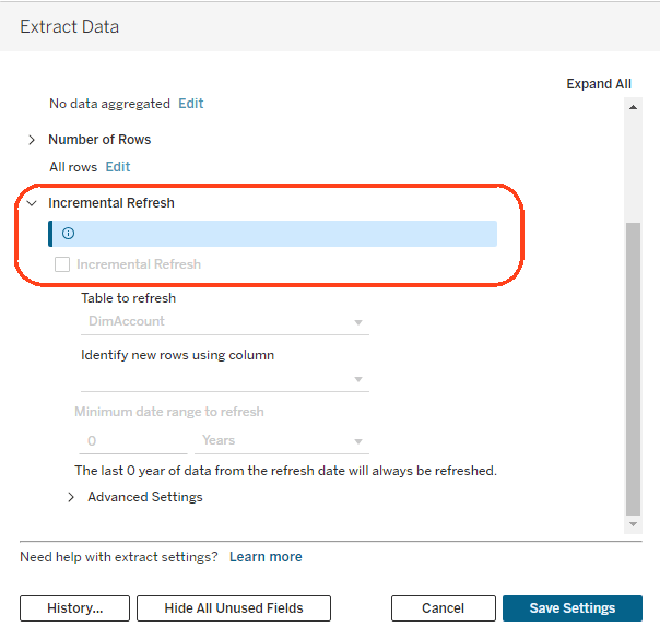
    Since this upgrade, I have seen more and more customers start using incremental refresh, and therefore had to debug more problems. This latest one was a bit strange – in some data sources, you simply couldn’t check the incremental checkbox, even though they were very similar to other data sources that had no such problem. They had a similar structure, the same database connection, and no special features. So what was different?

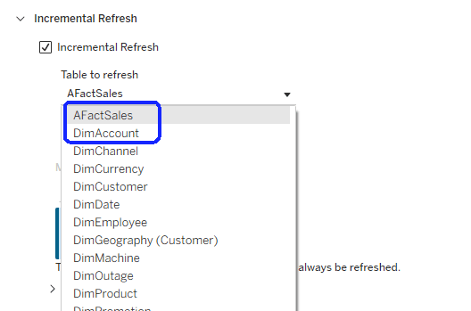
    The solution was found by Vered, an analyst for one of my customers. When you first open the Incremental refresh dialog, the dropdown list of tables is sorted alphabetically, and the first table is displayed. If that table is not eligible for an incremental refresh, because it has no relevant fields, the options are disabled. In the screenshot above, the DimAccount table is the first in the list, and includes only text fields, so I’m stuck.

    Obviously this is a bug, and I’m opening a case with Tableau Support, but there’s a very simple workaround: rename one or more of the tables so that the first in the list includes a numeric or date field. Note that special characters aren’t taken into account, and regular letters come after capital letters. In this same data source, I renamed “FactSales” to “AFact Sales”, and the problem was solved.

    Incremental refresh is very useful with very large data tables, and is now becoming even more powerful, with Composable Data Sources (CDS). You can still only define one incremental table per data source, so what if it includes two or more gigantic tables? With CDS, you can split such a data source into several parts, define an incremental refresh on each, and reassemble them using CDS into a data source that is identical to the original.

    Tableau 2026.2.1 was released a couple of days ago with CDS enabled, so within a few months this feature alone will encourage customers to upgrade their servers and start saving valuable resources on extracts.

  • User Defined Functions

    A common feature of many programming languages is User-Defined Functions (UDF). These are currently missing from Tableau, and I think adding such an option would be a real benefit to developers – what you might call a “Quality of Life” improvement.

    What do I mean by UDF? I mean functions that can be created just like calculated fields, but with placeholders for parameters or fields so that they can be re-used several times, instead of being re-written with slight variations. We’ll start by defining an option for the syntax, and then look at a few examples.

    What I can envisage as syntax for a UDF is similar to a normal calculated field, but with a placeholder for a referenced field or parameter. For example, let’s say I have a calculation for Sales in various periods:

    Calculated fields: 

    Current Period Sales:               SUM(IF [Current Period] THEN [Sales] END)

    Previous Period Sales:             SUM(IF [Previous Period] THEN [Sales] END)

    Parallel Period Sales:                SUM(IF [Parallel Period] THEN [Sales] END)

    Implementation using a UDF:

    (This is a definition of a UDF accepting a parameter called <field1>)

    Current Period Sales:               [Period Sales]([Current Period])

    Previous Period Sales:             [Period Sales]([Previous Period])

    Parallel Period Sales:                [Period Sales]([Parallel Period])

    This is just a simple example, of course. I’m sure that if Tableau decide to implement something like this they’ll find a good idea for the exact syntax.

    UDFs have two great advantages. One is that you can re-use complicated expressions by simply changing the referenced field, as in my example, saving the effort of duplicating them and making small changes. The other is maintainability – if you need to modify the calculation, you only have to modify the UDF, and not multiple similar calculated fields.

    I’ve encountered countless situations where this could be useful, but let’s just mention two of them. One is an expression commonly used (with lots of variations) to format numeric fields as text (originally from The Information Lab):

    IF ABS(AVG([Population Total])) >= 1000000000 THEN
    //round for billions
    STR(ROUND(AVG([Population Total] / 1000000000), 1)) + 'b'
    ELSEIF ABS(AVG([Population Total])) >= 1000000 THEN
    //round for millions
    STR(ROUND(AVG([Population Total] / 1000000), 1)) + 'm'
    ELSEIF ABS(AVG([Population Total])) >= 1000 THEN
    //round for thousands
    STR(ROUND(AVG([Population Total] / 1000), 1)) + 'k'
    ELSE
    STR(ROUND(AVG([Population Total]),0))
    END

    Now assume that you need to format several numeric fields, not just [Population Total]. Today, you have to duplicate the calculated field for each one, and replace the [Population Total] with the numeric field name. Then, if you decide to modify the formatting logic, you have to go and edit each one, wasting valuable time and increasing the chance of errors. A UDF would make life much easier!

    Another example is dimension switching, where we use a parameter to enable the user to switch between dimensions in a worksheet:

    CASE [Select Dimension]
    WHEN “State” THEN [State]
    WHEN “Category” THEN [Category]
    WHEN “Sub-Category” THEN [SubCategory]
    WHEN “Customer” THEN [Customer]
    END

    I some scenarios I have four such fields, nested one after the other (or two on rows and two on columns), all with the same dimensions but based on different parameters (which have the same list of values, but that’s another issue). So I have four similar copies of the calculation above, each using a different parameter name, and if I decide to add a new dimension to the user’s options I have to modify all of them. A simple UDF would help.

    There’s already an idea about this on the Salesforce Ideas list, but I know it’s not on the roadmap. Nowadays everyone is working on AI and more advanced ideas, but this should have been implemented years ago.

    Tableau has many other pain points, of course, and maybe one day I’ll post a list of the ones that hurt the most – and I mean stuff that seems to be easy to fix, not anything requiring major modifications. This is just one example, and maybe we’ll see it one day…
  • Moving Stuff in Tableau

    Moving Stuff in Tableau

    Here’s a list of 7 small and less well-known things you can move, sort or select in Tableau Desktop. If you know about all of these, you’re a Jedi. I won’t tell how many of them were under my radar, for how many years, because it’s embarrassing.

    Obviously there are many more similar features, but most are well-known. I consult with a lot of developers, and I picked these based on my experience of what usually gets missed.

    1

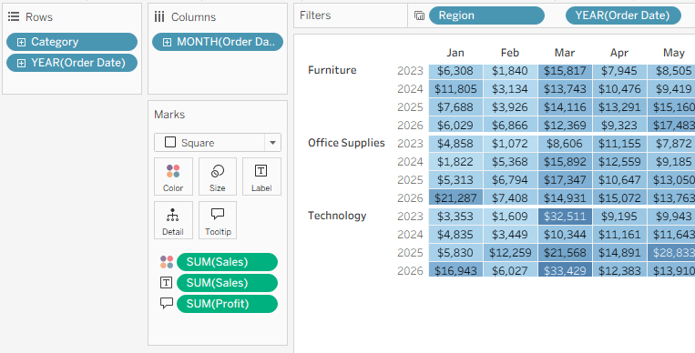
    Drag the cards around (filters, rows, columns, etc.)

    Note – the new layout is saved per worksheet, not for the whole workbook.


    2

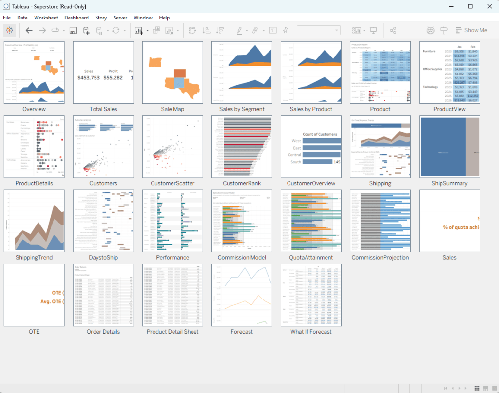
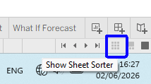
    Use the Sheet Sorter to organize your dashboards/worksheets – it’s the small icon on the bottom right.

    Tip – if it’s not showing all the thumbnails, you can right-click anywhere and “Refresh All Thumbnails”.


    3

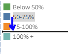
    Drag legend items to reorder them in the chart.


    4

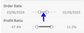
    On a range filter (numerical or date), if you drag from the center of the range it keeps the interval constant and moves both ends of the range.

    This is good for users as well as developers.


    5

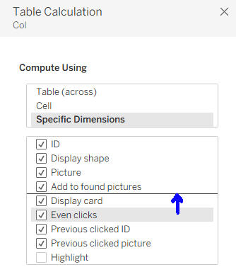
    When editing table calculations, the fields can be dragged into the right order.


    6

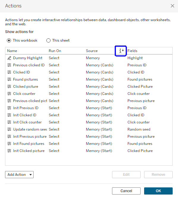
    Dashboard or worksheet actions can be sorted by clicking on the column header.


    7

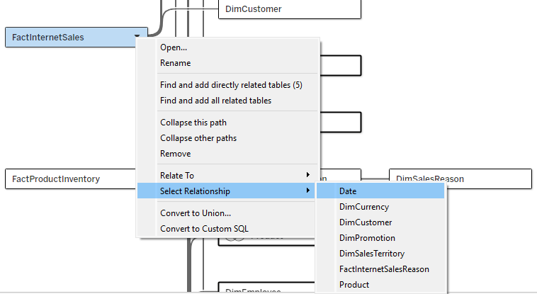
    If you’re having trouble clicking exactly on a relationship “noodle” to select it in your data source, go to the menu for one of the tables and “Select Relationship”.

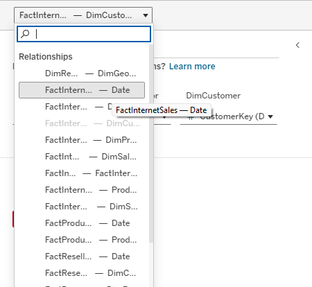
    You can also do this from the dropdown above the relationship/table details pane, but the text there is always cut off (though it has a tooltip).

  • Internal Ranking

    Internal Ranking

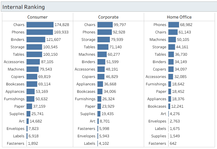
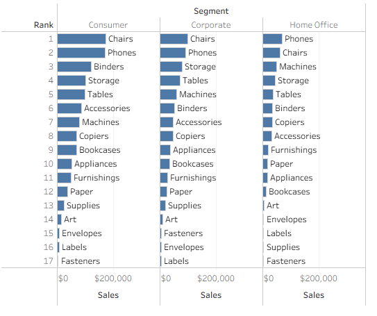
    A customer recently asked me how to display a bar chart like this:

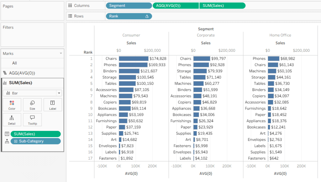
    You have segments (any dimension) on the columns, and then the bars are sorted and labelled by the categories (any other dimension) on the rows.

    If your segments are static you can have 3 separate worksheets side by side, but that’s not the proper way to do it, and it won’t work if the segments themselves are changing based on some other filter. Fortunately, Tableau has Table Calculations, and there’s a neat and simple solution.

    The only calculated field I need is [Rank]:   RANK(SUM([Sales]))

    I then place this on Rows, Segment on Columns, drag Sales to Columns in order to create bars, and add Sub-Category to Detail.

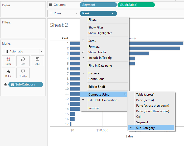
    What a mess! Just one more thing… go to the menu for Rank and Compute using → Sub-Category. And we have a bar chart, sorted separately for each segment.
    The rest is just formatting, but it’s the important part:

    • Add Sub-Category to Labels on the bars.

    Nice, but that’s not what the customer wants. The Sub-Category has to be to the left of the bar, and the value as a regular label.

    • Add a new field on Columns: AVG(0)
    • In the menu for this field, apply Dual Axis. This temporarily messes up the chart.
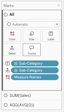
    • We now have three Mark cards on the left:
    • On the All card, remove Measure Names
    • On the SUM(Sales) card, change the mark type to Bar, and drag Sales to Label instead of Sub-Category
    • On the AGG(AVG(0)) card, change the mark type to Gantt Bar, and drag Sub-Category to Label. Change the Label alignment to Left.
    • Right-click on one of the axes and Synchronize Axis. Then drag the AGG(AVG(0)) pill in the Columns so it’s before (to the left of) the SUM(Sales) pill.

    You should be seeing this:

    The rest is pure cosmetics:

    • Format Lines to remove the grid lines from the chart.
    • Unclick “Show Header” on the Rank pill.
    • Edit each axis (top and bottom) so it shows whatever you need, or remove them altogether using Show Header on the green pills.
    • Format the bars and labels in any way that you want

    And the end result is as required, with the number of columns flexible – you can even enable the user to switch dimensions easily using a parameter. Each column has the Sales sorted and labelled neatly by Sub-Category.

    There are more complicated use cases, of course, such as negative values that can overlap with the labels. In such cases some tweaking of formulas is needed, but this is the basic technique. And my customer is already using the technique in a production dashboard.

  • The % Filter

    Tableau won’t always behave exactly the way you want, but if you know and understand how it works, you can apply simple solutions for many of the small irritants. This is one of them.

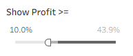
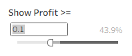
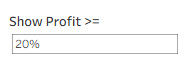
    I was asked this question about a percentage filter. The worksheet is filtered by a percentage measure, and there’s a quick filter by range, with type-in values – which looks OK, until the user tries to type in the value, and discovers that instead of “10%” or “10”, she has to type in “0.1”.

    The measure is already formatted as a percentage, so what can a person do?

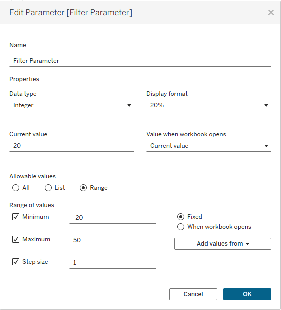
    First, create a parameter with the desired range of values.

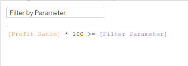
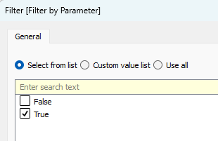
    Next, create a calculated field filtering by the parameter, drag it to the Filters pane, and select “True”.

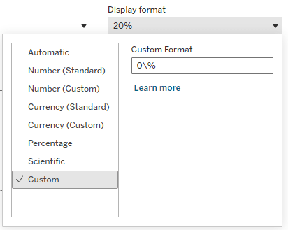
    Now comes the trick. Format the parameter with the custom format “0\%”. Unlike the “0%” format, which will multiply the value by 100 in the display (try it), the backslash is an escape character that is not shown, and renders the following character as a simple text. So the “0” format is a regular number, and “\%” just adds a % suffix.

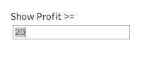
    Now, when the user clicks in the box to type in the value, she can type in the actual percentage number.

    Mission accomplished.

  • Tableau Text Wrapping

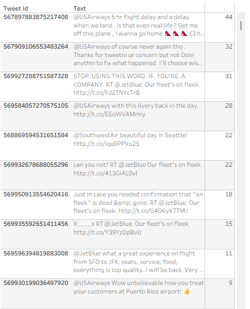
    Recently someone noted that Tableau tables don’t do a great job displaying long text fields – the row height can be adjusted to accommodate any number of lines of text when it is wrapped, but it is fixed for the whole table, not dynamic per row. Look at the example below (just some old tweet dataset that was lying around), and you can see that all rows have exactly 3 lines, so in many cases there is blank space, or an overflow (two dots at the end):

    Is there a solution? Built-in there isn’t, but a couple of calculations can certainly help and format our text table more efficiently. This is how it’s done.

    First, I define an integer parameter called “Text length” and set the value to 40. I’ll use it later.
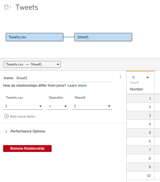
    Now I need to add an “expander table” to my data source. This is a simple table (I usually use Excel) with a column of numbers, from 1 to as many as needed. In the example I don’t expect to display more than 10 lines of text, so I limit the table to 10, but it can be a lot more. The relationship between the table and my data table is set as a full cross-join: 1 = 1

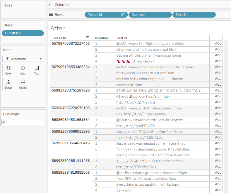
    What I’m going to do now is split the text field into separate lines, by finding the first space after every N characters (N being my parameter) and cutting the text at that point. For this I use 3 calculated fields:

    Cutoff N (this marks the first space after N * Number characters (or the end of the text)

    IF FIND([Text], ” “, [Number] * [Text length]) = 0 THEN LEN([Text])+1
    ELSE FIND([Text], ” “, [Number] * [Text length])
    END

    Cutoff N-1 (this is the previous space)

    FIND([Text], ” “, ([Number] – 1) * [Text length])

    Text N (cut out the text from [Cutoff N-1] to [Cutoff N]

    IF [Number] = 1 THEN LEFT([Text], [Cutoff N])
    ELSE TRIM(MID([Text], [Cutoff N-1], [Cutoff N] – [Cutoff N-1]))
    END

    Note that I’m using the [Number] field from my expander table to define the line number (N), and the number of characters in each line of text depends on the [Text length] parameter.

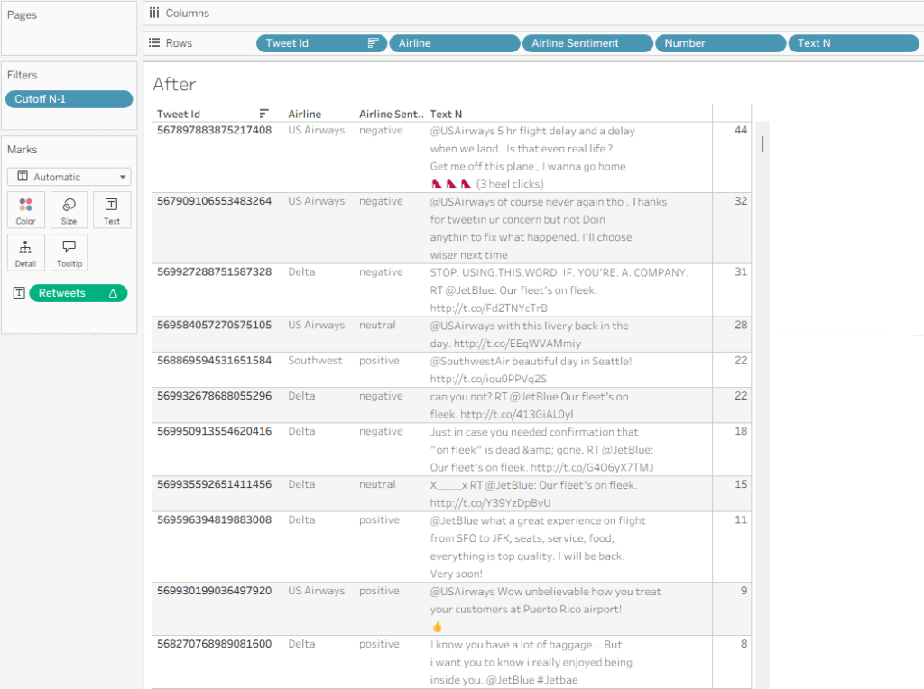
    Place [Number] on rows, then [Text N], and I get my table with the text field split nicely into lines:

    I can use the Text length parameter to play with the field width, and see what it looks like with different values.

    A few additional formatting steps:

    • Uncheck “Show Header” on the Number field in Rows.
    • Format the Borders so the lines within the text disappear.
    • Fine-tune the row shading.
    • If there’s no field after Text N, switch the mark type to Polygon so the “abc” disappears.

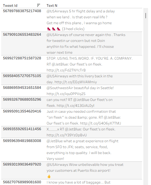
    And I have a formatted text table:

    Now let’s say that I need some data field to the right of my text – in this example I’ll use “Retweet count”. If I just add the field, it will display the same value for each line of text, so I need to use a table calculation:

    Retweets

    IF FIRST() = 0 THEN SUM([Retweet Count]) END

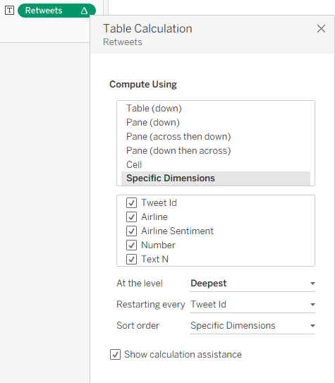
    I can add this, and then Edit Table Calculation using the following settings:

    This enables me to show the value only for one row, and my finished table, with the additional columns, looks like this:

    Summary

    The data in this sample dataset isn’t varied, with most tweets being around the same length, but you can see how a flexible number of text lines per data row can improve the look and feel of a Tableau table. So it’s not impossible – you need just a relatively simpke workaround. And that’s part of the power of Tableau: with a little imagination and some calculated fields, you can tweak your visualizations and solve many display problems without any coding.

  • Measure Value Indicators

    Measure Value Indicators

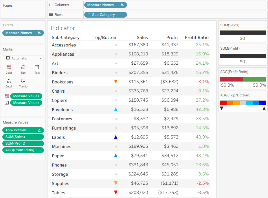
    As usual, this post started from a customer request. They had a nice table set up in Tableau, with Measure Names and Values (quite complicated ones), and they wanted to add a column with an indicator for each row – just a colored dot, but with 4 different colors.

    At first I said it couldn’t be done without re-engineering the whole table, but then I thought about it and suggested a solution similar to the following example, which is already working nicely in production.

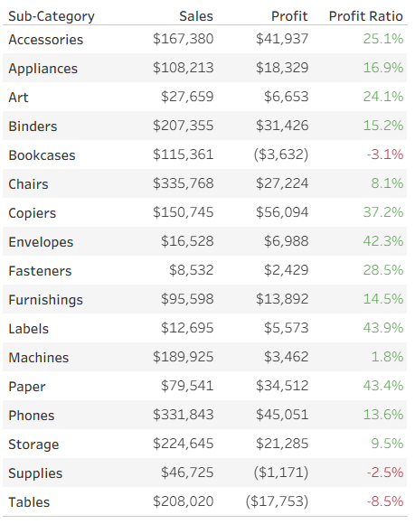
    Let’s start with a simple table of measures, already colored using Separate Color Legends:

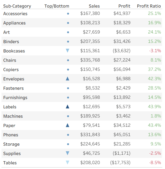
      Now we want to add a colored indicator for some of the rows, based on a calculated field – I’ll take the ranking of Profit Ratio as an example. To stretch Tableau to the limits, my requirement is to display an upward pointing triangle for the top 3 rows (Sub-Categories) in Profit Ratio, a downward pointing triangle for the bottom 3, and a circle for the rest. In addition, the top 3 should be colored in shades of blue, the bottom in red, and the others in light gray. Impossible? No!

      I start by defining my calculated field. What I need is a series of numbers, not the actual value (which is displayed separately in this case), and you’ll see later how these numbers support the visual element. I’m aiming for the numbers from 3 to -3:

      IF RANK([Profit Ratio]) <= 3 THEN 4 – RANK([Profit Ratio])
      ELSEIF RANK([Profit Ratio], “asc”) <= 3 THEN -4 + RANK([Profit Ratio], “asc”)
      ELSE 0
      END

      This gives me the values 3, 2, 1 for the top 3 rows, -3, -2, -1 for the bottom 3, and 0 for the rest.

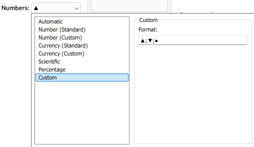
      I can now leverage two of Tableau’s formatting features to create my indicators. First, the number format – I define a custom format:  ▲;▼;●

      What does this mean? Every number format is divided into three sections, separated by semicolons. The first is for positive numbers, the second for negative numbers, and the third for zeros. I’ve told it not to display the actual value, but a single character in each section (it could be any unicode text).

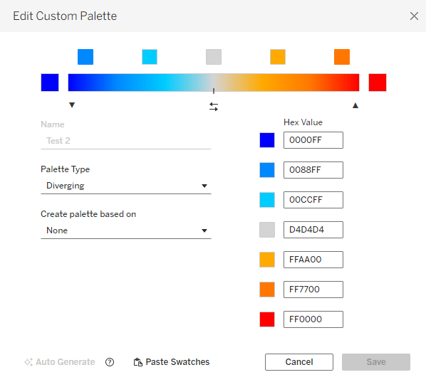
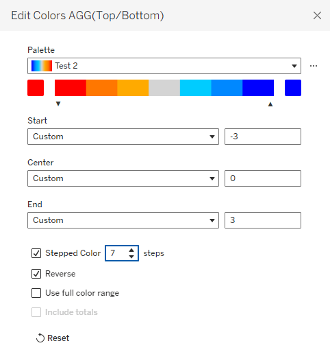
      Then, in addition, I can use Tableau’s color options and define a custom diverging color palette, with as many colors as I want. This is much easier in versions from 2025.3 onwards, that have the custom palette editor within Tableau, but can also be done by modifying the preferences file :


      Note that it’s important to define the same number of colors as numbers that I’m using for the indicators, and for the numbers to be evenly distributed. That enables me to fix the palette scale from the lowest to the highest number, and when I define Stepped Color with the corresponding number of steps, each number in my measure gets its own color:

      That’s it. I have my indicators in a simple Measure Names/Values table, without changing the whole structure of the worksheet.

      Remember that this technique has constraints: not more than 3 special characters or texts, and theoretically you can define any number of colors, but I haven’t checked Tableau’s limit (maybe 20?). But the bottom line is that it allows you to add colored shapes as indicators to a table of measures, as an additional column, and that can be very useful.

    • Sorting Date Filters

      Sorting Date Filters

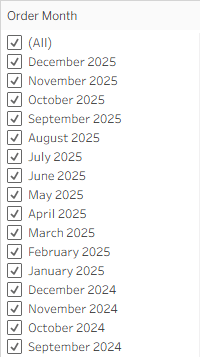
      Recently I was asked, not for the first time, if Tableau could sort dates in a filter in descending order. Well – it can, sort of. But you need to know how to manipulate the fields a bit.

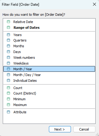
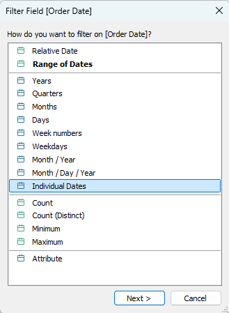
      Let’s take a simple case: I want to filter by month and year, but to see the latest month at the top of the list. So I drag my Order Date field to the Filters card, and select the Month / Year option.

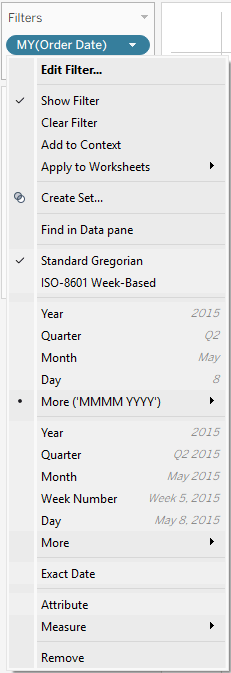
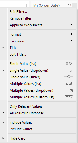
      Now I can look at the menus in both the Filter card and the worksheet itself (after showing the filter), and there is no “Sort” option in either.

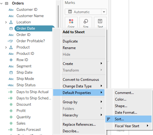
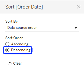
      So I’ll try to set the default sorting of the Order Date field to descending order, using the menu: Default Properties → Sort, and then checking the Descending option.

      Then I drag the field to Filters again, and… it stays in ascending order.

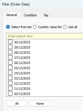
      But what if I choose the Individual Dates option? Suddenly, the dates appear in descending order, but I have every date (day) there. It doesn’t work if I select any other date level.

      So what’s happening here? Dates are a special type of field, and Tableau automatically aggregates them unless told otherwise – to years, months, or some other level. And it always sorts the aggregated dates in ascending order. The Individual Dates option is the only one that is not aggregated, so it retains the default sorting.

      How can we work around this problem? Let’s say that we need a filter displaying months, and sorted in descending order. We first need to create a field that has individual dates at the month level. There are two ways of doing this:

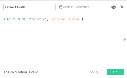
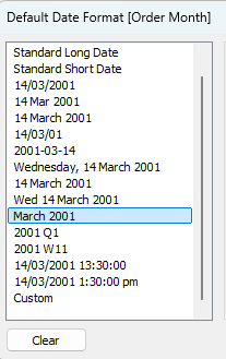
      • Create a calculated field, using the DATETRUNC function (more about that in a previous post), and also set its default format to something appropriate.
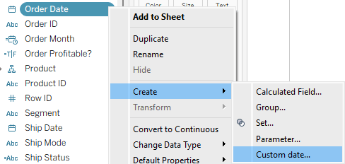
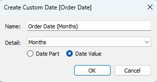
      • Create a Custom date field – one of the lesser known functions in Tableau. Select the “Months” option and “Date Value“.

      Now we can set the default sorting for the field, drag it to the filters, select the Individual Dates option, and the months will appear in descending order. Mission accomplished!

      Summary

      We now know that there are two conditions that have to be met in order to see dates in descending order in a date filter:

      1. The default sorting of the date field is set to “Descending”.
      2. The filter is not aggregated, but showing individual dates.

      We can manipulate the dates as necessary, but in the end those two conditions have to be met. All the rest is the usual Tableau trickery 😊

    • Don’t Extract an Extract

      Don’t Extract an Extract

      Recently, not for the first time, I was contacted by a Tableau customer: “We have a published data source, but after we refreshed the extract, the data in the dashbords isn’t updating!”. Why? Caching? A wrong connection? No – they had extracted the extract. As I’ve seen this mistake quite often, I’ll elaborate a bit.

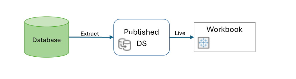
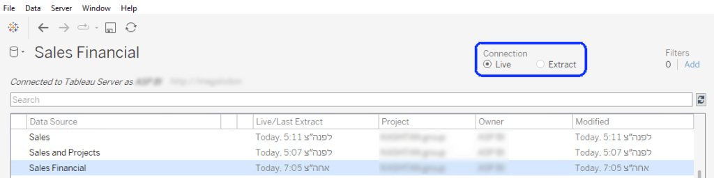
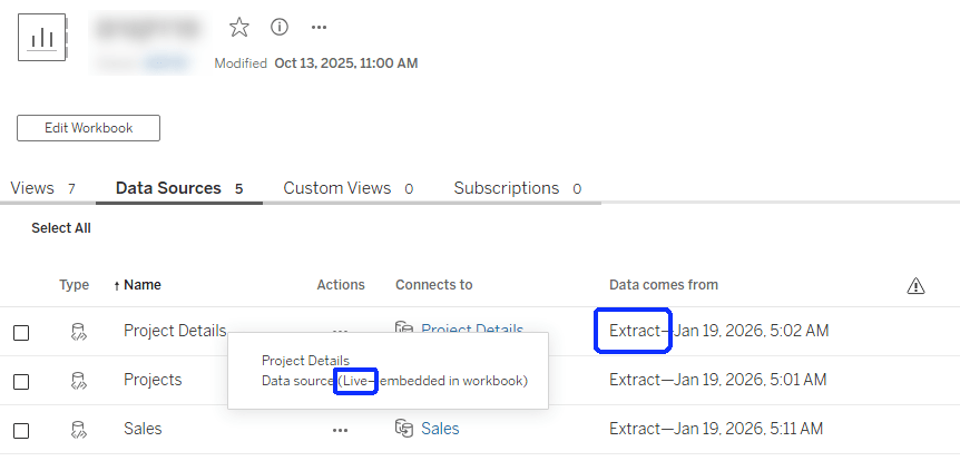
      When you’re using a published data source (on Tableau Server or Cloud), the mode – live or extract – is defined in the data source. Afterwards, when connecting to the DS from a workbook, the connection has to be live, because you’re querying the DS directly in both cases. If it’s live, the queries to the database are sent through the DS definition, and if it’s an extract the data is queried from the extract on the server.

      The mistake is in thinking that because the data is extracted, the DS has to be defined as an extract within the workbook as well. That will actually create another extract, at the workbook level, that simply pulls all the data from the published DS and saves it within the workbook. And then, if you refresh the original DS data, the workbook is still using its own extract (which hasn’t been refreshed), and the dashboard data isn’t updated.

      So this is the correct configuration:

      In Tableau Desktop:

      And on the server it should look like this:

      And next time you encounter a workbook that’s “stuck” with outdated data, just make sure that you haven’t extracted the extract by mistake!

    • Text Bars

      Text Bars

      The most memorable Tableau trick that I encountered at DataFam Europe this year was something that I already knew of (vaguely), but seeing it twice brought it to my attention and now it won’t be pushed to the back of my trick cupboard again.

      This was presented both by Andy Cotgreave in DataFam Slam (minute 36:00), and by Nhung Le in Tremendous Tableau Tips (minute 20:00), with different context (you need to register for Salesforce+ to see the videos). I’ll discuss just the technique, and what it can be used for.

      So what are text bars? You can use a text field in Tableau to create a horizontal bar, and also manipulate its length using the data. This is possible due to the existence of the Unicode characters “█” (U+2588: Full Block) and “▒” (U+2592: Medium Shade).

      Let’s say we want to display our count of orders per customer, which is not a very large number, in bars within the table header. We create a calculated field:

      REPLACE(SPACE([No. of Orders]), ” “, “█”)

      The SPACE function returns a number of spaces as defined in the parameter that you give it (up to a limit, of course – don’t try to exceed 100 or so), and then we replace them with the Full Block character. The result is a text bar, that can be placed as a header in the rows of out worksheet:

      The label at the end is a simple concatenation:

      REPLACE(SPACE([No. of Orders]), ” “, “█”) + ”   ” + STR([No. of Orders])

      Another option is to use the text bar to display a percentage value, though it has to be rounded. In this example I am rounding to the nearest 5%, and filling up the 100% with the partially shaded bar:

      REPLACE(SPACE(ROUND(MAX([Profit Ratio], 0) * 20)), ” “, “█”)
      +
      REPLACE(SPACE(ROUND(20 – MAX([Profit Ratio], 0) * 20)), ” “, “▒”)

      Note the MAX function, which I am using to eliminate negative values.

      The end result is below. No concatenated label this time, because formatting the percentage value to a string is complicated, so I simply added the Profit Ratio value as the next field. The Segment field is there to show that the bars are within the header.

      Andy showed how text bars can be used within tooltips (before Viz in Tooltip was released), but I’m sure the community will think up other implementations, apart from the simple spicing up of a table that I showed, and probably using other special characters as well.