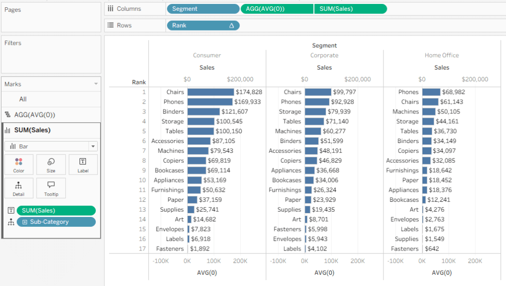
A customer recently asked me how to display a bar chart like this:
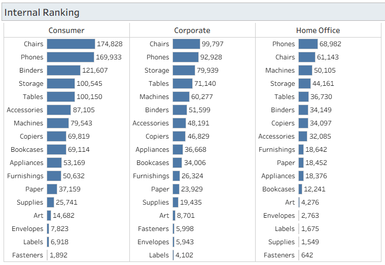
You have segments (any dimension) on the columns, and then the bars are sorted and labelled by the categories (any other dimension) on the rows.
If your segments are static you can have 3 separate worksheets side by side, but that’s not the proper way to do it, and it won’t work if the segments themselves are changing based on some other filter. Fortunately, Tableau has Table Calculations, and there’s a neat and simple solution.
The only calculated field I need is [Rank]: RANK(SUM([Sales]))
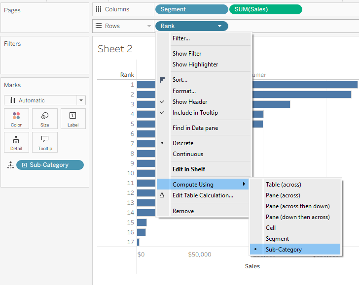
I then place this on Rows, Segment on Columns, drag Sales to Columns in order to create bars, and add Sub-Category to Detail.
What a mess! Just one more thing… go to the menu for Rank and Compute using → Sub-Category. And we have a bar chart, sorted separately for each segment.
The rest is just formatting, but it’s the important part:
- Add Sub-Category to Labels on the bars.
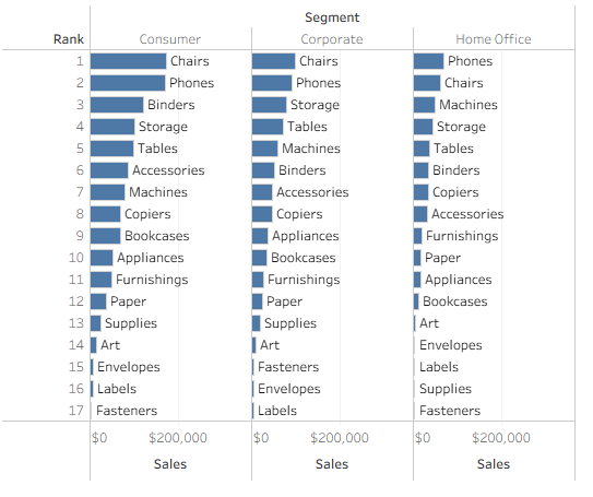
Nice, but that’s not what the customer wants. The Sub-Category has to be to the left of the bar, and the value as a regular label.
- Add a new field on Columns: AVG(0)

- In the menu for this field, apply Dual Axis. This temporarily messes up the chart.
- We now have three Mark cards on the left:
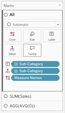
- On the All card, remove Measure Names
- On the SUM(Sales) card, change the mark type to Bar, and drag Sales to Label instead of Sub-Category
- On the AGG(AVG(0)) card, change the mark type to Gantt Bar, and drag Sub-Category to Label. Change the Label alignment to Left.
- Right-click on one of the axes and Synchronize Axis. Then drag the AGG(AVG(0)) pill in the Columns so it’s before (to the left of) the SUM(Sales) pill.
You should be seeing this:
The rest is pure cosmetics:
- Format Lines to remove the grid lines from the chart.
- Unclick “Show Header” on the Rank pill.
- Edit each axis (top and bottom) so it shows whatever you need, or remove them altogether using Show Header on the green pills.
- Format the bars and labels in any way that you want
And the end result is as required, with the number of columns flexible – you can even enable the user to switch dimensions easily using a parameter. Each column has the Sales sorted and labelled neatly by Sub-Category.
There are more complicated use cases, of course, such as negative values that can overlap with the labels. In such cases some tweaking of formulas is needed, but this is the basic technique. And my customer is already using the technique in a production dashboard.


Leave a Reply