Tableau shows great flexibility in creating and displaying measures, with a built-in “Measure names” dimension that has some of the characteristics of a regular dimension, but not enough of them. I have encountered several use cases for a “real” Measures dimension:
- Enabling the user to select a set of measures to be displayed in a table or chart.
- Creating groups of measures, like a hierarchy, for selecting or even aggregating values.
- Calculating a Balanced Scorecard for multiple measures.
In one case, a customer needed a scorecard based on 50-60 calculated measures, grouped by subject, with different threshold values for each measure, and a logic for aggregating the scorecard results up to the subject level. Technically it might have been possible to implement this using calculated fields, but “The Pivot” was our solution, and it worked!
Let’s develop an example using (of course) Superstore data. I’ve created a number of calculated fields, and these will be my measures, or KPIs:

I now have to create a KPI table, with a list of my KPIs (measures) and some supporting properties. My table is in Excel, but of course it can be a database table as well. A simple table would look like this:

I now add this table to my data source, using a 1=1 relationship to link it to the base (fact) table. Note that the relationship between the tables has the same fixed value on each side, so technically it is a full cross-join:

There is no need to be alarmed by the cross-join, which could theoretically create a cartesian multiple between the tables. Relationships in a Tableau data source are activated only when called upon by the analysis, and we will see how to do that selectively in a moment.
The next step is to add a new calculated field. I’m going to call it “KPI Value”:
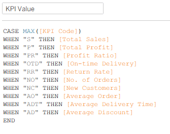
The calculation takes each row in the KPI table, and links it to a different measure, or calculated field. All the calculations have to be aggregated, otherwise you will get the dreaded “Cannot mix aggregate and non-aggregate…” error, but you can use actual calculations as well as field names, such as:
WHEN “S” THEN SUM([Sales])
Now I have a measure called “KPI Value”, controlled by a “KPI Name” dimension, which can be filtered, grouped, or otherwise manipulated just like a normal dimension (though totals across this dimension are probably meaningless). For example:
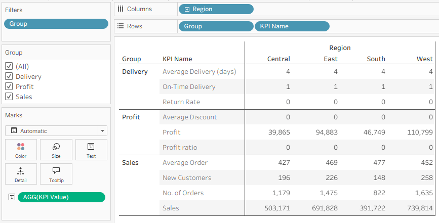
OK, but this looks weird. The measures are on totally different scales, so percentages appear as 0 or 1. We need to format the values, and this is where the “Format” field in the table comes in handy. In the example I have three options – “N”, “D”, “%” – but you can use as many as you need. Two additional calculated fields give us a formatted text value for each measure, that can be dragged to Label or Tooltip as needed:


And the end result is:

Note the ability to use “Group” as a hierarchy or a filter.
Great. This is very useful, but there’s another level that we can add here – setting threshold values for all the KPIs, within the KPI table. I am leveraging the existence of this table, and adding a few more fields:

The “Color” field is just a text description of a color, or state (the contents could also be “Good” or “Bad”, for example), but the “Color from” and “Color to” fields define a range of values for the KPI, that we can then color by the “Color” field.
(I know, too many meanings of the word “Color”. But it’s worth it…)
To implement this in our worksheet, I added one new calculated field:
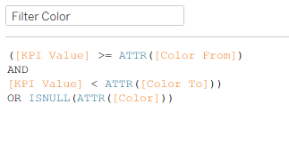
This filters the rows for each KPI so that only one “Color” row remains, and also takes into account those with no threshold values and just one row. I can drag it to the Filters card, filter by True, and drag the Color field to Color:
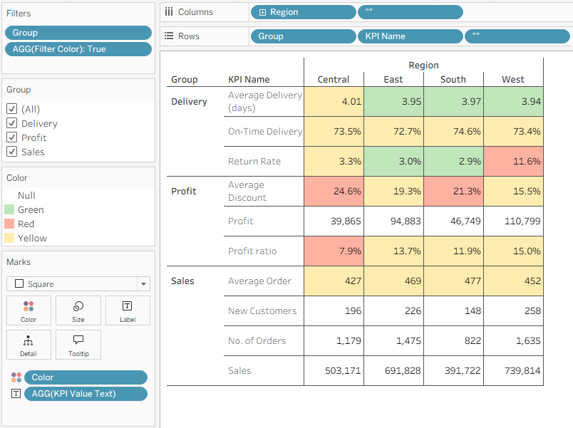
And that’s already a type of Balanced Scorecard, highlighting measures (KPIs) by their performance. Any changes to the thresholds can easily be made by updating the KPI table, and the purists will split it into two tables, KPIs and Thresholds, with a join between them using KPI Code.
This is Tableau, of course, so it can get even more complicated – and powerful. My original customer had three tiers of “Accounts”, with different threshold levels for each, so I simply added another level into the KPI table, multiplying the number of rows by 3 again. But it worked.
A word of warning: this is a great technique, but it’s not good for performance. The original use case had 300+ rows in the KPI table, and less than a million in the raw data, and performance dropped to 30+ seconds per view, but the analysis was so powerful that my customer was still happy with it. So use it with care, and don’t expect something that works instantaneously with Superstore data to be as fast with tens of millions of rows and 40-50 KPIs.
Note: the technique has also been tested with Tableau’s new multi-fact relationship model, and it works. There are two important considerations:
- Link the KPI table to one of the fact (base) tables, and not a dimension table.
- Each KPI calculation should be based only upon measures from a single fact table, otherwise results can be unexpected. That’s because the relationship model won’t know how to join the two tables before performing the calculation.
The workbook that I used is published on Tableau Public, and the KPI excel file is below:

Leave a comment