As usual, this post started from a customer request. They had a nice table set up in Tableau, with Measure Names and Values (quite complicated ones), and they wanted to add a column with an indicator for each row – just a colored dot, but with 4 different colors.
At first I said it couldn’t be done without re-engineering the whole table, but then I thought about it and suggested a solution similar to the following example, which is already working nicely in production.
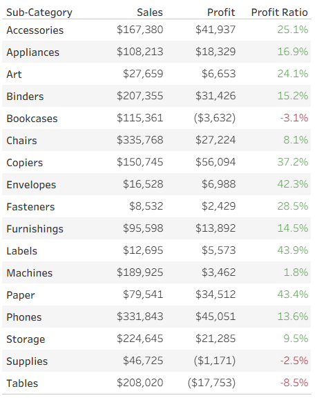
Let’s start with a simple table of measures, already colored using Separate Color Legends:
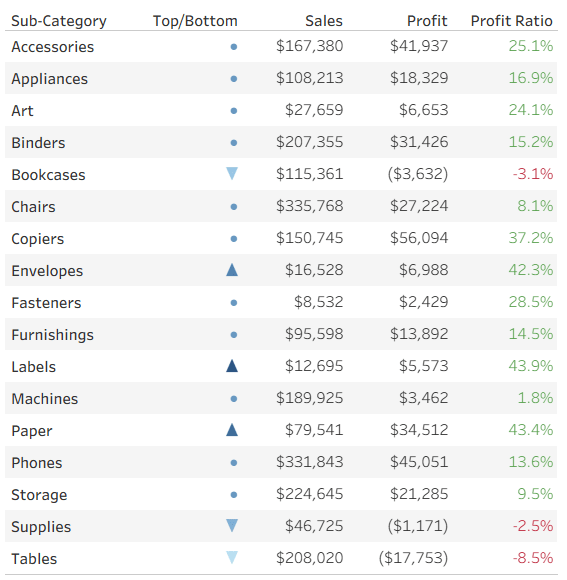
Now we want to add a colored indicator for some of the rows, based on a calculated field – I’ll take the ranking of Profit Ratio as an example. To stretch Tableau to the limits, my requirement is to display an upward pointing triangle for the top 3 rows (Sub-Categories) in Profit Ratio, a downward pointing triangle for the bottom 3, and a circle for the rest. In addition, the top 3 should be colored in shades of blue, the bottom in red, and the others in light gray. Impossible? No!
I start by defining my calculated field. What I need is a series of numbers, not the actual value (which is displayed separately in this case), and you’ll see later how these numbers support the visual element. I’m aiming for the numbers from 3 to -3:
IF RANK([Profit Ratio]) <= 3 THEN 4 – RANK([Profit Ratio])
ELSEIF RANK([Profit Ratio], “asc”) <= 3 THEN -4 + RANK([Profit Ratio], “asc”)
ELSE 0
END
This gives me the values 3, 2, 1 for the top 3 rows, -3, -2, -1 for the bottom 3, and 0 for the rest.
I can now leverage two of Tableau’s formatting features to create my indicators. First, the number format – I define a custom format: ▲;▼;●
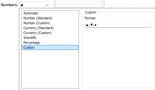
What does this mean? Every number format is divided into three sections, separated by semicolons. The first is for positive numbers, the second for negative numbers, and the third for zeros. I’ve told it not to display the actual value, but a single character in each section (it could be any unicode text).
Then, in addition, I can use Tableau’s color options and define a custom diverging color palette, with as many colors as I want. This is much easier in versions from 2025.3 onwards, that have the custom palette editor within Tableau, but can also be done by modifying the preferences file :
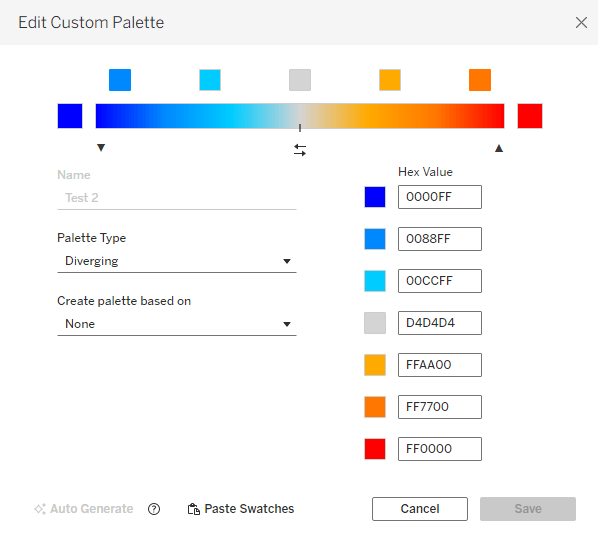
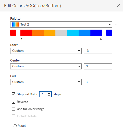
Note that it’s important to define the same number of colors as numbers that I’m using for the indicators, and for the numbers to be evenly distributed. That enables me to fix the palette scale from the lowest to the highest number, and when I define Stepped Color with the corresponding number of steps, each number in my measure gets its own color:
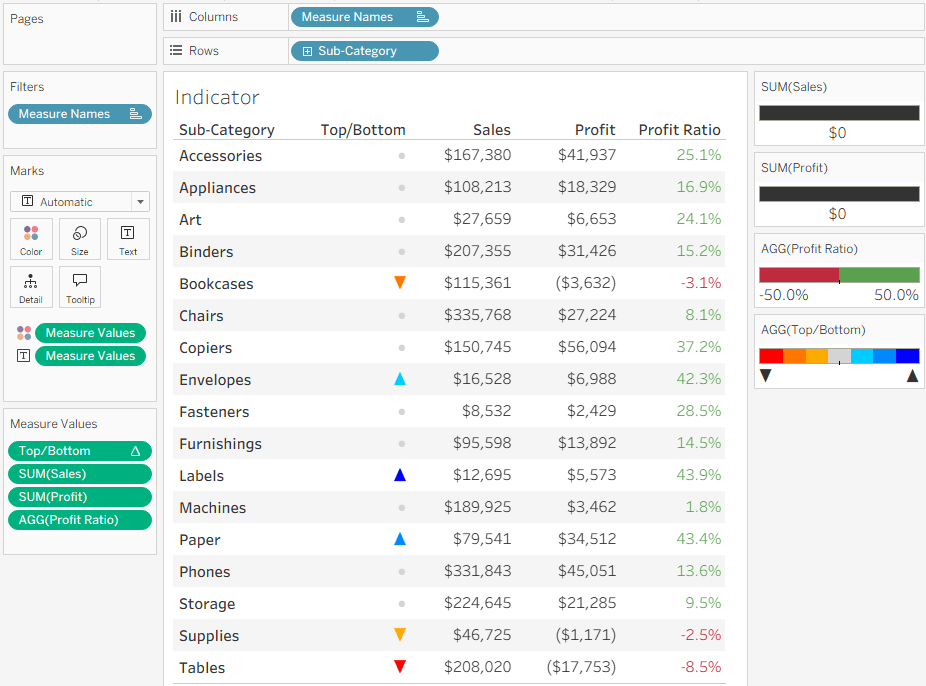
That’s it. I have my indicators in a simple Measure Names/Values table, without changing the whole structure of the worksheet.
Remember that this technique has constraints: not more than 3 special characters or texts, and theoretically you can define any number of colors, but I haven’t checked Tableau’s limit (maybe 20?). But the bottom line is that it allows you to add colored shapes as indicators to a table of measures, as an additional column, and that can be very useful.

Leave a comment